Monday, November 24

A Limited Palette with Acrylics?


Today’s Image

In the Studio

Last week I finished an acrylic I worked on for a couple of days. It was not painted en plein air or from a reference photo as I don’t live anywhere near a desert nor have I taken a photo like this. The scene is totally from my mind’s eye, and is actually a compiled memory of both my residency and travels in the American Southwest. Although I titled it Deming Spring, it is not painted from anything real in Deming, New Mexico, USA; it is, however, a painting of an imagined spring morning there. My palette was Grumbacher's cobalt blue hue, cadmium yellow medium, cadmium red medium, burnt sienna, Payne's gray; Winsor & Newton's Galeria viridian, titanium white; Winsor & Newton's Finity olive green; and Liquitex's alizarin crimson. It’s Today’ Image.

My Opinion on Color Palettes

Before moving on to other art topics in upcoming Orbisplanis art blogs, I wanted to wrap up with a discussion of my opinion on color palettes.

When I renewed my interest in art in 2007, a color palette was not near the top of my interests—in fact, it wasn’t even on the list. As previously mentioned, not until I got interested in pastels (and later acrylics) did I even think about a color palette. With pastels I learned that most artists use a full array of pastel colors or at least as many as they can afford. In my reading and research on pastels, I don’t recall seeing the term palette used much, if at all, rather the discussion is more around how to mix and blend (optically and physically) as many pastel colors as you have at your disposal to achieve your goals. I’m guessing that the term palette was connected more with oil painting (using a wooden palette with a thumb hole to mix the paint) than with pastels. The Impressionists and other artists of their era used pastels in addition to oil paint. This was long before acrylics were invented, of course.

With acrylics I have gone from one extreme to the other I guess you could say. That is, I was initially drawn to acrylics not only for their speed and convenience but also because of all those colors! When you shop for acrylics you are bound to get hooked on all those colors hanging there on the racks. Depending on the brand, you have dozens of choices in what seems like every possible color. When I started painting with acrylics, I first bought the suggested palette of colors. A consensus of sources seem to agree on the ones I mentioned last blog, give or take one or two--cobalt blue, ultramarine blue, Paynes’ gray, viridian, burnt sienna, yellow ochre, cadmium lemon, cadmium yellow, orange, cadmium red, permanent rose, violet, and titanium white. I bought them all and more. It became like a game whenever I entered an art supply store—which color will I buy next? I would think of all the scenes I could paint with those colors, which I’m sure is what the marketing people at the acrylic paint companies intended. I haven’t counted but I must have at least 75 colors although some are duplicates.

However, as I kept researching art and artists I learned more about limited palettes. I learned that Claude Monet at one time used only cobalt blue, cadmium yellow medium, cadmium red, viridian, alizarin crimson, burnt sienna, and titanium white, and he seems to have had a pretty successful career :-). It’s highly likely, however, that there were only a few colors available then due to high cost and limited technology. I also read that the best way to learn about colors is to mix them yourself using a limited palette.
As I said, I went to the other extreme and for a while used only a limited palette. If it was good enough for Monet, then it’s good enough for me I reasoned. I did learn something about mixing colors, which is good. But maybe it’s my relative inexperience, or maybe it’s the way I mixed colors, but my paintings with a limited palette all seem to somehow look the same. Not the same motif, but they all have similar colors that make them look like they came from the same artist. Maybe that’s what the great artists did, but I found it disturbing that a desert landscape and a seascape looked oddly the same.
So today anyway I am of the opinion that I (and you) as the artist can do whatever I (you) please. You want to use a limited palette just like the Impressionists? Be my guest! You want to buy all the acrylic paints at your art supply store? Go ahead! In fact, you may need to. I discovered that you can only buy the color 'hot pink' (Winsor & Newtion Galeria Opera Rose). There is no combination of other (acrylic) colors you can mix to achieve it. So there!
I’m advocating experimentation, which I believe is the cornerstone to creativity. You may just become that next great artist who changes the art world for the next hundred years.

Cheers!

Thursday, November 20

Using a Color Wheel to Paint


Today’s Image

In the Art Library

In the last few Orbisplanis blogs I’ve been discussing color palettes and wanted to share a resource with you. It’s not specifically about color palettes per se, but it is a resource I found extremely useful. I mentioned last blog when I was experimenting with pastels what I thought I needed was information on mixing or blending pastel colors. As it turned out, I found that many artists discuss different methods of painting with pastels; some talked about blending (with your fingers or a torchon, for example), but others said you’d be better off using all the pastel colors available to you for optical (rather than actual) blending. Others instead recommended scumbling, masking, and using fixatives during the process.

It can almost go without saying that I initially found pastels somewhat difficult, and still do. However, my search for information on color mixing led me to the book I mentioned last blog: The Acrylic Paint Color Wheel Book by John Barber (I mistakenly recorded the title with ‘color wheel’ as one word, but it’s two). It was this book that made me move from pastels to acrylics.
If you’re an artist who is always looking at the Art section in bookstores, used bookstores, art supply stores, and the like, as I am, you may have seen this book. I think it stands out from many of the art reference and how-to books because it has an actual Color Wheel built right into the cover of the book. It’s a pinwheel with a rivet, and you can turn a tab on the cover to reveal the blended colors in slots without even having to open the book. Cool.

The colors on the color wheel are the de facto palette for what’s provided in the book, which is exercises for you to complete to learn all kinds of techniques using acrylic paint. Last blog I listed the colors, and they are: cobalt blue, ultramarine, paynes’ gray, viridian, burnt sienna, yellow ochre, cadmium lemon, cadmium yellow, orange, cadmium red, permanent rose, and violet. I forgot to mention that the color wheel didn’t include white, but white is used as a color in some of the exercises, so I recommend using titanium white, which is used almost universally.

I found the book very useful in learning the basics of mixing and using color. I don’t know if it was getting to turn the color wheel that made me want to experiment and do many of the exercises, or what, but it really helped me, and it might help you, too.

In the Introduction there is a relatively brief but comprehensive discussion understanding color, the basics of the color wheel (primary, secondary, tertiary colors, etc), and terminology so you understand the difference between hue, intensity, and tone. Confession--I still get confused and have to reference it.

There is a section called How to Use This Book, which tells you exactly how to use the color wheel when doing the exercises. It tells you the different sections on the pages of the exercises and how to use them: the finished painting, what you will need, color mixes, step-by-step, techniques, and artist advice and tips, to name a few.

There is a section on Materials and Equipment, which goes into everything you need to not only get started, but to be successful: paints, supports, brushes, easels, etc.

There is a section Basic Techniques, which covers different painting techniques for painting broad areas, fine detail, and stippling, for example. It also talks about color mixing, glazing, washes, overlays, opacity, and on and on.

The majority of the book, however, is devoted to the eight projects included. This is the ‘meat’ of the book, I think, and the one you’ll find most useful. There is a nice variety of projects that covers most popular styles and subjects, and will give you practice in trying new things. There’s a still life, architecture, a seascape, a landscape, a floral, a figure, and wildlife. And before you begin the exercises, there is a Gallery with examples of beautiful acrylics to get you inspired.

I recommend The Acrylic Paint Color Wheel Book for anyone interested in learning about using acrylics or who wants to improve working with color.

In the Studio

Well, I got inspired just looking at the color wheel book again, and began and almost finished my next acrylic alla prima (see Artist ‘Factoids’ in the right-hand column). I’ll post it when I’m done.
Cheers!

Tuesday, November 18

Learning About Color Palettes


Today’s Image


Continuing last blog’s topic of color palettes, I’ll tell you how I progressed in my color education since renewing my interest in art and painting in the summer of 2007. The discussion is mainly about my interest and journey in acrylics and how I progressed in that medium although I also made color choices with pastels and oils, too. Today's Image represents mixing colors with a color palette.

In past Orbisplanis blogs I told how starting with graphite and pen & ink drawings, I then tried pastels before moving to acrylics (and some oil) painting. When I first worked with pastels, I learned about their unique properties and characteristics mainly through trial and error. If you’ve painted with pastels, then you know that, more often than not, you really need a pastel of a specific color rather than mixing or blending. Of course, artists do blend, mix, and scumble pastels all the time to achieve specific colors. However, you may have noticed that sets of pastels come in no less than boxes of 12 and more often they are offered in sets of 24, 48, 64, 128, etc. These boxes are your pastel color palette although you may only use a subset of them for a particular piece.

At the time, I acquired several boxes of pastels, one with 64 colors. While experimenting with pastels to achieve pleasing colors, what I really needed was something that would help me with mixing colors. One day while at Barnes & Noble I quite unexpectedly found this: The Acrylic Paint Colorwheel book. At the time, I did not realize this was but one in a series of ‘colorwheel’ books that were available not only for acrylics but also for pastels, oil, and watercolor. Had I known there was also a pastel ‘colorwheel’ book I would have looked for it. But I was glad to find a book that provided a simple formula for mixing colors, albeit acrylics, and I bought it with the idea that I could use the same principles for pastels, which I did.

But I digress. Long story short, after a couple of months of pastel painting using the colorwheel book, I was also reading it and all about acrylics. I decided to give acrylics a try. The cover of the book is actually a colorwheel, which is a recommended palette. Without using acrylic paint brand names, only the generic and traditional names of colors, the palette is: cobalt blue, ultramarine, paynes’ gray, viridian, burnt sienna, yellow ochre, cadmium lemon, cadmium yellow, orange, cadmium red, permanent rose, and violet.

Using this book, I also learned the difference between hue, tone, and color, and a whole lot more. Next blog I will review The Acrylic Paint Colorwheel book in In the Art Library.

Cheers!

Friday, November 14

What is a Color Palette?


Today’s Image

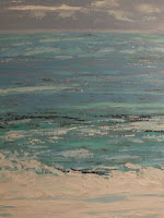
The last few Orbisplanis blogs were about painting from reference photos, so I wanted to show you one of my acrylics that I completed late last month ( October, 2008). I mentioned this acrylic a few blogs ago, but had not posted it. I painted it from a reference photo I found online at a travel website if I recall. It’s of the surf somewhere in the Caribbean and to repeat, my palette was: Reeves Cerulean Blue, Amsterdam Sky Blue Light, Van Gogh Greyish Blue, Fundamentals Cadmium Blue Green Light Hue, Liquitex Basics Light Aqua Green, Grumbacher Payne’s Gray, and Winsor & Newton Galeria Titanium White as my palette. I used the same process I discussed in the last blog except that I was not the photographer. Anyway I wanted to post it for you, and it’s Today’s Image.

Color Palettes
If you read art books or take art classes or just like to experiment with color mixing, you’ve probably thought about your paint color palette, or maybe you haven’t. If you’re an artist who believes that ‘anything goes’ when it comes to art; that is, art is in the eye of the beholder, then you may not have a palette at all. If every canvas is a new beginning, then you may not think of a palette except in the context of your immediate artwork.

But I’m getting ahead of myself. I looked up a definition of color palette and will share these two.
One is one from Answer.com that is very traditional: a board, typically with a hole for the thumb, which an artist can hold while painting and on which colors are mixed; the range of colors used in a particular painting or by a particular artist, also known as a limited palette.

In the digital age, it can be much different, so here’s the other from PC Magazine: also called a "color lookup table," "lookup table," "index map," "color table" or "color map," it is a commonly used method for saving file space when creating 8-bit color images. Instead of each pixel containing its own red, green and blue values, which would require 24 bits, each pixel holds an 8-bit value, which is an index number into the color palette. The color palette contains 256 predefined RGB values from 0 to 255.

I Googled ‘color palette’ and received 2,370,000 hits—can there really be that much information on color palettes? Apparently so. And there’s a whole range of discussion on the subject.

I found this basic discussion on About.com, which gets back to basics by asking, “what colors do you need to start painting with acrylics?” It then gives you nine colors to start with and a primer on why each one is good: cadmium red medium, pthalo blue, cadmium yellow medium, titanium white, mars black, burnt umber, pthalo green, orange, and purple. I am not advocating this palette at all, but just wanted to give you what someone (an artist, I presume) thinks you should start with.
At the other end of the spectrum (no pun intended) is the digital side of color palettes. As I said, I found 2,730,000 hits when I Googled ‘color palette.’ The no.1 hit is Color Palette Generator and when you click on it, you enter the world of digital color palettes, used more often than not, by professional graphic designers for on-screen visual effects and websites.
The site is DeGraeve.com and on the site if you click About, it says: “DeGraeve.com has focused on developing tools to solve specific "problems." Sometimes that problem is generating an ASCII art version of your face. Other times the problem involves divining a color palette from an image or making your own business cards.” What?
What I found it to be (and you may be interested, as I was, to play around with it) is a tool that allows you to select an image, and the Color Generator will provide the digital color palette of the image. Cool. Try it, and appatrently there are a lot of other color generator tools out there, too.

While this tool is for digital palettes, I found it helpful for regular old ‘analog’ colors (and regular artists) in that you can eyeball-match these colors and attempt to mix them using the basic palette provided on About.com or other basic color palettes as well.

In the Studio

It’s time for me to select my next piece, which I will ponder this weekend, and let you know next blog or two what I’ve decided.

Cheers!

Tuesday, November 11

How I Paint From a Reference Photo


Today’s Image


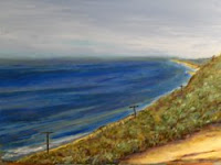
Last blog I wondered if the Impressionists would have used reference photos, and I decided that, yes, they would have, considering photography was brand new in that era. I also said I’d be discussing my own process for painting from a reference photo, so here goes. Today’s Image is my acrylic painting—North of Goleta-- painted from the reference photo overlooking the Pacific (north of Goleta, CA, and shown in my last blog).


I said I wouldn’t really call it a process (my painting from a reference photo, that is), but more like working in the moment. But, first things first. When I began drawing and painting again in 2007, I started by looking for interesting, inspiring, art-worthy subjects that caught my eye in photographs in magazines, brochures, and online mostly. I just mainly wanted to draw or paint subjects that would help me to renew and sharpen my drawing and painting skills. Most were paintings I did for my own education and enjoyment.

After I decided I might want to try to show my artwork at shows, festivals, galleries, or whatever, I decided to ask a professional artist for advice on reference photos. His advice: if you’re going to submit your artwork in shows, etc, you, as the artist, should also be the photographer of the reference photo used for the painting. Otherwise, your rendering would actually be a copy of the image as seen and photographed by someone else. I believe the key point is that if you submit artwork for ‘public’ viewing, it should be entirely your own—your imagination, your subject, your viewpoint, and your style and rendering.

That said, you do have a great deal of latitude in the outcome of your work. If you took the photo yourself, you were obviously there (at least physically, let’s hope!), so you also have a lot of ‘information’ about what was happening in the moment that may not show in the photo. For example, you know the time of year and time of day and what the day (or night) lighting was like even if the photo shows something different. You may also be aware of the dynamics of the situation, and can add, if appropriate, potential action or anything else not apparent in the photo. So remember you have a lot of freedom when painting from a reference photo.

So what do I do?
  • First and foremost, select your reference photo carefully as this determines the motif for your painting.
  • Second, and you probably have already decided this, choose the medium (and I’m assuming either acrylic or oil, but could also be pastel or other) and support (canvas, linen, paper, etc).
  • In this digital age I’m assuming you’re using your digital camera and printer, so scan or download your photo, then print it out in as large a format your printer allows.
  • Next carefully study the photo to determine if it looks the way you remember or if you need to mentally (or digitally) crop the photo to better focus on the subject or subjects. Your art instincts should tell you where your viewer will enter and move around the painting.
  • This is important—be aware that the colors on your computer screen and/or the colors printed out on your printer may or may not match what you viewed and experienced, so decide what, if any, changes you want to make now.
  • After considering the color effect of the photo, select your palette; you may already have a standard one you always use no matter what the subject, or you may want to (or have to) add/ subtract/change hues as you deem necessary for what you want to portray.
  • Next, think back to the time or even the moment in which you took the reference photo—what were you trying to capture in the photo; how were you feeling or what was your state of mind; think about your subject—if inanimate, how was it situated (lighting, perspective, etc), if a living thing, what was it’s demeanor, etc? Determine what in the photo makes it art-worthy for painting.
  • Then sketch the major elements on your support (as you normally would).
  • Now, remembering the time at which the photo was taken and using your natural or a selected style, paint deliberately and boldly from the reference photo; keep in mind any element, or elements, you want to emphasize or de-emphasize; likewise, determine if you want the color values of your painting to match that of your reference photo, or do you want to change them to be more or less true to the moment?
  • Your artistic vision for your artwork from a reference photo will be realized—so that's it, congratulations!

By the way, in North of Goleta, I painted the sky as it appeared in the printed photo rather than on the computer screen, which more closely matched what I saw in person when the photo was taken. On the computer, the sky in the photo appeared a much brighter blue than I remembered. As I recall, the sky was a bit more pale and hazy especially on the horizon; so that is how I painted it.

Cheers!

Friday, November 7

If Impressionist Painters Had Used Reference Photos in Plein Air Paintings


Today’s Image

I’m following up on an In the Studio segment from one of my recent blogs. It’s the one where I was talking about finishing my acrylic of a view overlooking the Pacific Ocean. I mentioned I ‘finished’ it several times but may also ‘finish’ it a few more. Today's Image is a photo of the scene.

I believe almost everything I read about plein air painting and plein air painters. If you follow this blog, then you know the Impressionists, with their 19th-century breakthrough of painting out-of-doors, are some of my most favorites. I’m pretty sure plein air painting does provide some special something that can only be realized ‘before your very eyes’ so to speak. The old saying, “you just had to be there,” is probably true in some respects, but don’t you think that a good, or especially a great, artist can capture a scene in the studio at a later time after having seen the subject firsthand? I do.

I have read about some of the Impressionist painters’ difficulties with outdoor climate, such as storms brewing up at the coastline and heat/cold/fog, while on the scene painting in plein air. But look at it this way, they were lucky enough to be living in a fairly temperate climate for the most part. We’re talking Parisian suburbs, Normandy coastlines, and sabbaticals to London and Tuscany. I’m sure the summers could be hot and the winters cold, but for the most part it was pretty darn nice with long springs and autumns for plein air painting. It’s no wonder their landscapes are magnificent.

I also discovered through reading that the Impressionists were greatly influenced by the camera and photography. Photography was new for the period. They used its viewpoint to their advantage, which gave them new perspectives in viewing subjects and cropping their artwork at the edges. Very new and high-tech for the time, and if you’ve read anything of the era, it was not well received. But now the Impressionists are regarded as Masters. Time certainly has a way of changing things doesn’t it?

But I digress. What about the rest of us today? There are a lot more of us now (1.5 billion vs. 6 billion), and we’re living all over the planet due to conveniences such as heating and air conditioning in places that would have been considered near uninhabitable in 1874. I maintain that if the Impressionists had had digital cameras or cell phone cameras, they would have used them.

Regarding my acrylic painting overlooking the Pacific, I initially reported that, “I like it so far and think it will turn out fine.” I had trouble getting the water to look right in addition to the perception of depth. This was because of the near foreground that overlooked a steep cliff while at the same time a hill rose to the right and simultaneously the viewer could see up the coastline for a distance not to mention the far horizon on the ocean.

Next blog I will tell you about my process for painting from a reference photo, although I hate to call it a process; it's more like working in the moment. Whatever. I think every painting (or creative endeavor) you undertake is unique in the way you come to it, at least mine are. I'll show you the 'finished' painting, too.

Cheers!

Tuesday, November 4

Art Festival Time!


Today’s Image

Somewhat unexpectedly on our final day in the Washington, D.C. area, we ran across a fall Art Festival in the streets of suburban Bethesda, Maryland. We were on our way to more sightseeing when we saw the banner on Wisconsin Avenue. It was the Bethesda Row Arts Festival, the 11th annual. Just shy of 200 artists were showing their works including all kinds of painting (oil, acrylic, pastel, encaustic), scultpture (bronze, steel, wood), ceramics, fiber, photography, and jewelry. A street scene of the festival is Today’s Image.

It made me think again that showing artwork at festivals around the country is one of the main ways artists have to sell their wares and get their work and name out before the public. It’s not only art, it’s a business and a lifestyle. I talked to several of the artists who said other than showing their work in a local gallery, if that, a festival is their main sales opportunity.

Many artists continually apply and are accepted to festivals that are happening year 'round, primarily in the spring and fall. They own or rent the street booth necessities, such as booth dividers, tents, tarps, hangers, tables, stands, etc. Not too far from the festival you can spot the artists’ parking area, which is full of RVs, trucks, vans, and SUVs. Although many of the artists at any particular festival are from the surrounding area, a good many travel regionally and even nationally to take part in the larger festivals.

In a previous blog, I had mentioned there are websites devoted to helping artists apply to festivals with sites for uploading artwork and paying application fees. The sites have a listing of participating festivals and email artist members with lists of upcoming festivals and emails that list imminent deadlines.

I don’t know how successful the average artist is in terms of sales at these festivals. They must do better than break-even because so many artists participate, and these are just the ones who are accepted. At least as many do not make the jury cut.

One thing I, and many others, like about the art festival as a venue is that you have a chance to meet the artists and find out more about their passion and methods. The Bethesda Row Arts Festival was held on a crisp, clear fall weekend, and by all appearances looked to be a success as there were crowds of people, and I saw several transactions in the time we were there.

I myself had applied to two art festivals in my region and was ‘declined’ by one and ‘wait-listed’ by the other. However, the night before we left for our Washington, D.C., visit, the art festival that had ‘declined’ me emailed to say they had two booths that had come available at the last minute, and was I interested. Unfortunately I had to ‘decline’ the last-minute offer. My business-head said they were just trying sell every last single booth space, but my art-head was saying I was good enough to be accepted (if only at the last minute). The deadline for the next spring event is the end of this week, so I might just apply again.
In the Studio
I have spent this week cleaning up my studio and organizing my supplies once again. It seems to be never-ending. But I added another drawer to my rolling cart--that makes seven now--and I think I can find everything easier and faster. I'll let you know. We'll see.

Cheers!