Thursday, December 31

A 'Mystery' Painting - Finding the Origin of an Unknown Painting & Artist


Today’s Image
Our Family's "Mystery" Painting
Photo Copyright 2009

I thought I’d close out the last OrbisPlanis art blog of 2009 with a mystery. I hope you like mysteries.

In my last blog I talked about several paintings that I remembered fondly from my grandmother’s home.

Today’s Image
is another painting originally from her home that has been in the family for at least 50 years, maybe more.

Funny, we never named this painting like we did the ones I mentioned in my last blog (Blue Boy, Pink Lady, etc.), and I don’t know why. It certainly deserves a name.

It also deserves a past, and that’s what the mystery is. Who was the artist who painted this, and where did it come from?

The painting has a few hints that I can share, although they only partially answer the above questions.

In the lower left corner of the painting, there is a signature. It’s “T Harris” --I'm pretty sure that’s what it is. After the signature is “52” which I’m sure is the year in which it was painted. Now, I’m assuming that's 1952. It’s unlikely from its condition, but I suppose it’s possible that it could be a very well preserved painting from 1852 (or older?). Also, it's oil on stretched canvas (I think, but it's been framed and you can't see the back). It's 15.5 x 19.5 in (39.4 x 49.5 cm).

The painting was a gift from an elderly neighbor friend of my grandmother’s in Houston during the 1950s. I only know the neighbor as “Mrs. Downey” who was originally from Calgary, Alberta, Canada. She had moved in with her daughter and son-in-law in Houston, Kay Newton and Dr. Bern Newton. I do not know if Kay’s maiden name was Downey or not.

I Googled several search words, of course, such as " T Harris, painter, artist, Houston, Calgary," but there were no hits remotely associated with the artist or painting.

And that, folks, is the extent of my knowledge of this painting. It has hung in various houses and various rooms at various times in which our family has possessed it.

If anyone has a clue to its origin, feel free to leave a comment or email me.

If it turns out to be a masterpiece by a famous, famous painter of whom I’m unaware, wouldn't that be a great way to start 2010!?

Cheers and Happy New Year!

Monday, December 28

Discovering "Blue Boy," "Pinkie," and "Red Boy"


Today’s Image
Sarah Barret Moulton: Pinkie by Sir Thomas Lawrence
In the Public Domain
This is the time of year when people tend to do a lot of reminiscing about holidays past and the year--in this case, the decade--coming to a close. That got me to thinking about some of the art I remember from my childhood. Without giving out the exact timeframe, I will only say that it was a while back.

Some of the art I remember from my grandmother’s house is indelibly burned up there in my brain, and I can see it "there" whenever I want to.

Hanging on her walls were "Blue Boy," "Red Boy," and "Pink Lady." At least that’s what she called them, so that’s what we called them. I’m still lucky enough to be in possession of "Red Boy" and "Pink Lady," although "Blue Boy" somehow vanished over the years.

These are framed prints, of course. If we had the originals, I wouldn’t be sitting here writing a blog about them, now would I?

I decided to do a little online research after I recently viewed "Red Boy" and "Pink Lady" again. Here’s what I found out. I hope you find it interesting.

"Blue Boy" is really called THE Blue Boy, and it’s by Thomas Gainsborough painted around 1770. According to Wikipedia it was Gainsborough’s most famous painting, and it’s a portrait of a man with the unflattering name of Jonathan Buttall. It says it is a historical costume study intended to pay homage to the Dutch painter Van Dyck of Charles II. It stayed in collections in Europe until it was sold to American railroad magnate, Henry Huntington, in 1921. It hangs today in the Huntington Museum in San Marino, California.

Based on the comment received by a reader, I subsequently edited this blog to clarify information about the painting known as Red Boy. Blue Boy and Red Boy are often thought of together because of the obvious similarity in names; however, the real Red Boy was painted by Sir Thomas Lawrence depicitng Charles William Lambton.

The painting we were calling"Red Boy" is actually titled Manuel Osorio Manrique de Zuniga by Francisco de Goya, painted about 1790. It shows a little boy in a fancy red suit with lace standing next to a cat and a bird cage. The original hangs in the Metropolitan Museum of Art in New York City.

And it turns out, "Pink Lady" is actually Sarah Barrett Moulton:“Pinkie” also by Sir Thomas Lawrence. It was painted about 1794. Sarah was the daughter of a wealthy plantation owner in Jamaica, and her family nickname was Pinkie. It also hangs in the Huntington Museum.

Anyway, I’m glad to know the actual titles and artists of these three paintings that I remember so vividly from childhood and which I still enjoy today. Perhaps they sparked my interest in art.

I have one more “mystery” painting from my grandmother’s house that I’ll discuss in my next blog. Maybe you can help me discover its origin.

Cheers!

Monday, December 21

Using RED in Your Artwork


Today’s Image
A Good Use of Red

I’m seeing red, and you probably are, too. You see a lot, and I mean a lot, of red this time of year. I’m pretty sure you would agree with this.

I like red. I really do.

I don’t paint with it a lot or even much at all--oops, make that any at all—I just checked the paintings I’ve done this year. There are no objects in any of my paintings that are painted red.

I’m talking red-red. I mean red, so that you can’t help but notice that something in the painting—like a rose or vase or a fire truck—is painted RED. That would be something painted straight cadmium red light or medium or some similar screaming red.

Now let me be specific, so you don’t think I’m not telling the whole truth. I actually use red in every painting I work on. However, it’s not the straight red right from the tube. Red being one of the three primary colors, of course, I use it freely and copiously—only it’s mixed in with other colors so that the correct hue and value are achieved.

Red is like the little kid in the shopping cart screaming at the top of his or her lungs for a piece of candy that Mom or Dad refuse to give. Please, would someone just stop him or her from making such a screeching racket.

Red is perfect for attracting attention, but you should—no, you must--use it sparingly; otherwise, if there’s too much of it, it loses its punch, if you know what I mean.

That’s what red is like, a punch. They must have been talking about red when they came up with the term “a punch of color.”

Have you noticed there’s no such thing as a royal red? There’s a royal blue and a royal purple, but no royal red. I think I know why.

Red is not a civilized color. It’s wild and wants to be free. No wonder the Fauves used it.

How about a nice alizarin crimson? Now there’s a civilized shade of red. Then there are all the maroons and the deep, dark cherry reds. Those are wonderful reds.

If you add white to red, which seems like the right thing to do to tone it down--watch out! You get pink, red’s bastard step-child. Pink is a completely different color from red, and it can ruin your painting if you try to mix it.

There’s an old joke you’ve probably heard about how to get your painting(s) selected for a show or juried exhibit. It goes like this—“if you can’t paint it big, paint it red; if you can’t paint it red, paint it big; but you’re better off painting it big and red!”

And that, my friends, is how I feel about red.

Cheers!

Thursday, December 17

A New Way to Illustrate and Author a Book!


Today’s Image
Jenny Gives A Pony Ride
A Book for Children
Copyright 2009

I wanted to tell you about a children’s book on which a fellow watercolorist and I collaborated—I authored it, and she illustrated it. First, the details—it’s titled Jenny Gives A Pony Ride (and it’s available now on Amazon.com). It's cover is Today’s Image.

I thought you may find it interesting the way the project evolved.

It all started last summer. One of the members of my watercolor class has a definite style of painting that is recognized as being open, flowing, soft, and which usually puts you in a cheerful or relaxed mood when you look at her paintings. She also illustrated a previous children’s book titled Too Too Many TuTus, a clever title I think.

This artist also likes to paint animals—dogs, cats, chickens, pigs, and cows, among others. One day she brought her painting of a donkey to class. During one of the breaks I casually told her she should write a story to go with the portrait of the donkey.

She replied. “Why don’t you write one?” I thought, well, OK, I can probably do that, and that’s how our collaboration started.

I thought about the story line for a couple of weeks, and actually wrote it in about a week. It’s about a little donkey named Jenny, which also happens to be the name for a young female donkey. Jenny lives on a farm with her family and best friend, Boswell, the dog. Jenny, who dreams of giving pony rides down at Old Main stables, wants to try out for the pony-ride team, but runs into an obstacle because she’s a donkey.

It’s really a story about how it’s OK to be different. I hope you and a child in your life, if there is one, enjoy it. Here’s the link to order one or you can just go to Amazon.com and type the title in the search box to find it on Amazon. (And thanks!).

Anyway, with the story in hand, the illustrator and I met for two or three work sessions where we decided which and how many paintings we thought we needed. It was totally an iterative and collaborative process. Sometimes the story dictated what the art should be, but sometimes one of her paintings added so much to the story that it was edited to accommodate the art.

The book was published and produced totally online through one of the new print-on-demand publishing or self-publishing services. Basically, you write the manuscript, plan and layout the art with the text, then save it as a PDF file, then upload it to the service. For a fee, you then receive proof copies, as many as it takes until you’re satisfied. The book is then “published” on the service’s site and also on Amazon.com.

It was a great experience where writing and art come together to produce something that I think readers, especially children, will enjoy. After you’ve read Jenny Gives A Pony Ride, please feel free to write your own book review on Amazon.com!

Cheers!

Monday, December 14

Are Art Rules Made To Be Broken?


Today’s Image
An Un-ruly Art Car
Photo Copyright 2008

Are there “rules” in artwork? I’ve been thinking about this recently as I work on my current watercolor. Hmmm…

I had a couple of false starts on my painting, and by that I mean, I actually started completely over. Why, you may ask, would I do such a thing?

Well, it seems my current painting contains architectural detail on several buildings in addition to a broad street that brings the viewer into the painting from the lower left corner—and, it seems, I did not straighten it properly as I laid down my sketch from the reference photo.

The view I’m painting is several stories above street level, looking out at the horizon and at the same time down to the street. One reason I wanted to paint this picture—it reminds me of some of the Impressionist paintings of Paris streets, and if it were reminiscent of that, that's fine by me.

Originally I was advised to straighten and align the painting so that the left side of the main building was more vertical (?) than it appeared in the photo. The camera “lies” or so it seems.

Therefore, I “straightened” the building as I sketched the main elements onto my relatively expensive sheet of 300-lb. watercolor paper. Then I happily began painting my picture.

However, during critique, parts of other buildings then looked askew to several people who viewed it.

The discussion about this straightening got quite involved, which is a word I don’t really like to use. We got off on eye-level and site lines and vanishing points—both above and below. This is in addition to the fact that it’s a foggy, misty day, which fuzzes up the whole thing.

The consensus from this discussion was that the painting would never “look right” due to the misaligned views, so much so that I got the impression viewers would experience vertigo or worse.

I started completely over with sketching the main elements on a whole new sheet of watercolor paper. And I began painting the picture again. I will show it to you when I finish it, but that probably won’t be for a few weeks and after the busy holiday period. But I will.

So anyway, to bring this discussion back to where it started—are there rules in artwork?

Well, of course, but are they iron-clad? In my humble opinion, no way. In fact, I think that’s what makes art, art. I know some, many, or most of the famous and well-know painters studied and followed all the art-school rules.

But aren’t spontaneity, creativity, and ‘joie de vivre’ (to throw in a little French) just as important? I certainly think so.

Cheers!

Thursday, December 10

A Practical Way To Frame Watercolor Paintings


Today’s Image
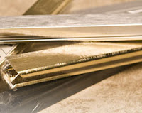
Metal Sectional Frames

Today’s blog is a about a practical way to frame your watercolor paintings-- at least what I think is a practical way. I’ve blogged about framing before, and I like to bring it up every once in a while because it is part of the whole art process.

If you’re a regular viewer, then you know I embrace frugality. Let me explain, if you will, being frugal is not the same thing as being cheap. I see cheap as being focused only on price with little or no regard for any intrinsic value and certainly not quality.

Frugality, however, is a lifestyle that seeks to find a balance in value and quality for the purpose of not wasting or needlessly squandering assets. It is the antithesis of consumerism and over-the-top spending. I see frugality as part of “being green.”

Okay, enough of that; back to my practical picture framing.

I am assuming that if you are a watercolor painter, then occasionally you want to frame your work in order to enter an exhibit or as a gift or simply to hang in your studio. I frame my watercolors for all these reasons.

Let’s face it. Framing can be expensive, or what I think is expensive; that is, upwards of $200US for a medium-sized painting and even more if it’s a custom frame job depending on the cost of living in your areas. The Plexiglas alone can cost $40-100US.

Let me add, I don’t want my paintings to look cheap. No, I want them to look professional. I don’t want the viewer to even notice the frame(s) in either a positive or negative way. It’s the art they should be looking at. An artist friend once heard a professional artist say that a frame is similar to a nice pair of shoes for an outfit—they should complement the outfit and neither detract from it nor attract attention to it. I like that, and wanted to pass it along.

So, being frugal, I asked several of my artist friends, some of whom are also frugal, what they do to frame their paintings.

Here’s what to do:

Purchase sectional metal frames (in black, silver, or brass--and Today's Image) in the lengths needed when they are on sale half-price. I can’t find a brand name, but I buy them at one of the chain arts & crafts stores in my area. They are usually on sale every third week or so. (You can’t assemble the frame without hardware, so don’t forget to get it in the little plastic bag next to the frames. You will only forget it once if you have to make an extra trip back to the store!)

Buy the less expensive foam core as the backing for your picture and frame. The arts & craft store I mentioned carries foam core in 30 x 60-in (77 x 153-cm) sheets for about $6US on sale, and you can cut them yourself to the size you need (very carefully, please) with an X-acto knife or similar.

Rather than buying the high quality and more expensive .25-in (.6-cm) Plexiglas at the arts or framing stores, I get the thinner, and less expensive, acrylic sheet. A big-box home improvement store in my area carries the Optix brand of acrylic sheets in the .08-in (.2-cm) thickness. It’s perfectly suitable, AND they will cut it to your exact measurements for FREE. You can’t beat this deal.

One piece that I DON’T scrimp on is the mat. It’s so integral to the beauty, or whatever, of your artwork that it needs to be done right. Buy a quality mat, and let the framing professional cut it for you. This is one time I don’t mind the cost (at least not too much). A 24 x 30-in (61 x 77-cm) mat cost me $13US.

Assemble the frame yourself. If I can do it, so can you. The metal sectional frames are relatively easy to put together. You have to align the corner pieces just so, but it’s easy once you get the hang of it. I first assemble three of the sections with two of the sections being the longest sides. Then stack the acrylic sheet, the mat, your painting, and the foam backing. Carefully slide this “sandwich” into the three assembled sections, and then assemble the fourth sectional side. Don’t forget to install the springy curved pieces that hold the picture tightly inside the frame, but WATCH OUT—those things can really spring back in your face, so you should wear eye protection.

All that’s left is to add a wire hanger, and your masterpiece is beautifully (and frugally) framed and ready for the spotlight.

Cheers!

Monday, December 7

Creating Art Cannot Be Rushed. Ever.


Today’s Image
This is how I feel this time of year
Courtesy of Edvard Munch

Time seems to have sped up considerably in just the last few weeks, and I feel suddenly behind in many areas. I don’t like that feeling of having to rush through life with tasks and appointments and “things” in general flying by like cars on a speeding passenger train, lights flashing and horns blaring.

I especially don't like feeling that way about my art.

Creating as well as viewing art should not be rushed. Ever.

Perhaps the act of painting should not be so painstaking, but neither should it be undertaken so quickly and casually that it doesn’t seem to matter.

Art should be calm.

And artists should be calm when they’re creating art. We’ve all probably seen caricatures of an artist painting away madly on a canvas like some mad scientist from an old horror movie. Artists know it’s almost never like that. But if that is the way you usually create art, then you need to speak to someone about it.

Try to remember, if everything is a priority, then nothing is a priority. That little gem didn’t originate with me, of course, but feel free to quote it.

I’m not talking about lolly-gagging around without a care in the world either. I’m just saying there needs to be some balance in life so your art can be accommodated--without rushing.

I’m guessing it’s the “season” we’re in—lots of activities to plan and to attend, lots to do, and to top it all off, everything you thought you would accomplish this year is speeding toward that wall that is December 31.

Here’s what to do.

Go to your studio, or wherever your artwork is waiting for you, and either physically or mentally shut the door.

Take a deep, cleansing breath as they used to say back in the last century.

Then, lose yourself in your current project, and all your cares will slip quietly away as if on little cat feet.

Plan how you’ll paint that red roof or that bluebird’s wing or the ear lobe on that portrait.

Mix and match those luxurious colors for your still life or your snow scene or your cityscape.

Pick up that brush, dip it into your oil, water, or acrylic paint pan, and fly away into your painting only to return when your mind is at peace.

Now, isn’t that better?

Creating art cannot be rushed. Ever.

Cheers!

Thursday, December 3

Painting Like the "Old Masters"


Today’s Image
The Mona Lisa, of course

If you are a regular reader of the OrbisPlanis, then you know I’m painting primarily with watercolor these days. I’ve been studying and practicing and painting with watercolor for about nine months now, so I’m an expert, right?

Well, of course not. I’m not even close, and will probably never reach that level of expertise. But, I do have fun trying, and I would like to think I’m nearing the point where, maybe sometime next year, I can say I’m no longer a beginner. Hope springs eternal.

The point is, as you’ve heard me say before, there is always something new to learn in art.

The tangent I’m currently on is my latest watercolor. I’ve just started on it, and I’m using as a reference photo, a shot of Pennsylvania Ave. in Washington, D.C., taken on recent trip there. It’s a rainy, misty, cool, damp day, and I want the painting to reflect that mood. As I was planning the process of painting this picture, I was advised that the best palette would be the Old Masters.

The what? Up to now, we’ve almost always used primarily the Standard palette of New Gamboge Yellow, Ultramarine Blue Light, and Cadmium Red Medium with a few ancillary colors, such as Hooker’s Green, thrown in for good measure.

Just when I was getting comfortable painting with the Standard palette and its light washes, now I would have to research this. I had heard talk of other palettes, such as Old Masters, along with the Delicate, Intense, and a few others. But now I was going to have to learn something new—again.

Several months ago a fellow watercolor painter let me borrow a book , Exploring Color, by Nita Leland. I remembered the author had called out several color palettes, one being the Old Masters with Burnt Sienna, Raw Sienna, Ivory Black, Payne’s Gray, Olive Green, and something called Neutral Tint (I think these referred to oil paints).

So, I thought I’d also do a little online research to see if I could find out more about the Old Masters palette. The first hit I Googled was from painting.about.com. It talked about Leonardo Da Vinci and his palette and techniques. I would certainly consider Leo to be an Old Master, or old anyway. It said he used “muted, earthy browns, greens, and blues within a narrow tonal range” with no intense colors, such as “bright red lips on Mona Lisa”--that about.com, what a joker.

I looked at a few other sites that weren’t very specific, and then I found colourlovers.com, whose tagline is color + design community for creative inspiration (how inspirational). I can’t exactly figure out the site because it looks like someone called ‘lostit’ selected this palette, and you’re supposed to vote on the colors or palettes or something and leave a comment. It may be these are colors for online viewing as the hex code numbers are also provided. Whatever. It did provide a palette chart showing the actual colors in a palette it called Old Masters 01. The colors are Burnt Sienna, Int (international?) Red-Yellow, Int Yellow-Blue, and Payne’s Gray.

Another site I receive email updates from had an article that said the painter used terra verde as an underpainting just like the Old Masters did in the Renaissance. That was the only place I saw the Old Masters palette, or any other palette, tied to a specific historical time.

I think I get it--the main attribute of the Old Masters palette is the use of low-intensity, muted colors that were used by many of the great, and not-so-great, painters a long time ago when painting as we know it was beginning to be developed. I speculate that the colors were muted not only because the culture was just emerging from the Dark Ages, but also because the availability of bright colors and tones was very limited.

Moving along, on my watercolor I’m using a similar palette of: Raw Sienna, Brown Madder, Green Gold, and Indigo that was suggested to me by an expert. I intend for my painting to be muted with low-intensity colors just like an Old Master, so everything should be just fine. I hope so. We’ll see, won’t we?

Cheers!

Monday, November 30

Visiting an Art? Museum in LA


Today’s Image
The Museum of Jurassic Technology

I’m back at the blog after a long holiday week-end in the US. I was out of town, and, as always, I try to shoe-horn in an art visit when I’m traveling, if at all possible. Being on a short schedule, I didn’t know if it would be possible on this trip.

But, as luck would have it, there were a couple of free hours on one afternoon, and I had made a short list of art venue possibilities if time allowed. I tried to select ones that were relatively close geographically so that travel should not be a factor.

Oh yeah, I forgot to mention, I was in Los Angeles, one of the largest metro areas in world, and traffic is always a consideration. Travel times can double or triple at the slightest freeway provocation. That turned out to be the case, so my plans went out the window.

However, some of the locals said there was an interesting museum nearby they’d been wanting to visit. While it was not an art museum, they did think there was some kind of art exhibited.

I should have known this would be a little bit different. For one, this was Los Angeles, and second, they said it was called something like the “museum of strange things" or something like that. So, we Googled the place, which is actually called The Museum of Jurassic Technology. From the name, I assumed it had something to do with dinosaurs or something but not art.

Their website doesn’t exactly explain what all is there, although it does say “guided along as it were a chain of flowers into the mysteries of life,” as if that explained everything. It also says the museum serves both the academic community with a specialized repository of relics and artifacts from the Lower Jurassic as well as the general public by providing a hands-on experience of “life in the Jurassic.” What on earth?

Well, now I had to go.

It’s tucked away in an old building so unassuming that you hardly notice it. See Today’s Image. It’s so unassuming there was a hand-written sign on the door that said something like “yes, we’re open, please come in.” When we entered, we could barely see because it was so dark, but there was a person at a desk who gladly took our “suggested donation” of $5US each.

I was surprised to see there were actually a good number of other people there, too, enough so that you had to move around each other carefully and say “excuse me.” I wondered how they had heard of this place, but didn’t really want to know.

I am not going to attempt to explain anything, and certainly not everything, we saw. That’s mainly because I can’t. I’m still not sure what some of the exhibits were. For one, it was so dark that you could barely see anything, and reading the placards placed next to the exhibits was almost impossible. The descriptions of the exhibits on the placards, while grammatically correct, made little sense.

One exhibit was a model of a waterfall, with actual flowing water, on a river between Brazil and Argentina where, in the 1930s, there had been an attempt to build a bridge; but the bridge had collapsed, and although there were many attempts by the Sonnenbergs—I think that was their name—to rebuild it, it never happened. There were three “listening stations” that you progressed through to hear this “fascinating” story.

Many of the exhibits are enclosed in glass cases, and you had to look through a magnifying glass to actually see what it is—one was intricate artistic carvings on what looked like an almond.

Another exhibit was the head of some furred creature that looked like a weasel, or maybe it was a hyena, and when you looked through the viewer, you could see--and hear-- a woman barking and making sounds like the animal, or so I assume. And don't miss the one on trailer park culture.

The closest thing to artwork were colorful collages of flowers, flowers in vases, crystal chandeliers, and other “objects” produced entirely from the scales of butterfly wings. Did I mention you had to peer through microscopes to look at each one? There was also a room full of x-ray photos of flowers that you had to look through 3-D opera glasses to see—if you want to call that art.

I won’t attempt to describe other exhibits, other than to provide a link to the Wikipedia article on The Museum of Jurassic Technology.

When you’re in LA, don’t miss it!

Cheers!

Monday, November 23

Take a Walking Tour of Your Art Supply Store


Today’s Image
Icon for Art Supplies


Continuing my last blog, which was my walking tour of one of my favorite art supply stores in town…

I left us at the end of the aisle where all the oil paints are displayed. You can find all the major brands. At the end of this aisle you have choice to make. You can either continue to the back of the store where there is lots of room to roam around, or you can make a hard left and visit even more aisles with more art supplies. I usually choose to go to the back half of the store to see what’s happening back there.

I don’t think I mentioned in the last blog, but this retailer also has a pretty complete choice of frames and framing supplies for all kinds of artwork in addition to a full-service custom framing department. There are about four aisles filled with all standard sizes and shapes of frames for every occasion including very ornate carved wood to the latest colors in metal frames.

I may have mentioned I’m frugal, so the only frames I buy here are the metal sectional frames that come in the colors black, silver, and brass and only when they’re on sale. I will buy a matte that’s cut to the size I need, but I usually don’t get the plexiglas here if I’m framing a watercolor because I think it’s too expensive—I get that at a big-box home hardware supply store. Of course, I do it myself and assemble the frame and plexi with my artwork.

Anyway back to my walking tour. The whole middle section is now relatively bare with just a few tables and easels haphazardly placed. However, this retailer is one of the few who caters to artists and those who want to improve their skills with real, live, hands-on art classes held right here in the store. I have been in the store when a lesson is in session, and this area is full of students, easels, and paint. Professional artists are available who give lessons in oil, acrylic, and watercolor as well as general drawing classes. That’s one of the things that makes this store unique.

Moving on, the entire left rear quarter of the space is devoted to canvases. I do believe they have the largest selection of canvases of any of the art supply stores in this area. There are rows and rows and stacks and stack of stretched canvases in all sizes from tiny ones to huge, almost mural sized ones. They also have a selection of rolls of canvas and stretcher bars in case you like to make your own. And there is always a sale on some of them, and you can save a lot if you shop carefully.

As you come toward the front of the store, there are even more aisles. One is devoted entirely to easels, bags, boxes, carrying cases, and portfolios for artists to transport their art supplies and artwork. They have a very good selection (although I think a fishing tackle box from a sporting goods store works just as well for paint, pencils, and paint brushes).

The next few aisles contain an assortment of items that, while not necessarily considered specialty, are possibly purchased less often than paint, paper, and brushes. I’m talking about drawing instruments and graphite pencils, colored pencils, watercolor pencils, pencil sharpeners, and art markers with points in all widths.

Then there’s a whole side of one aisle that contains nothing but pastels, hard and soft, in all shapes and forms. And over to the right is a book and magazine section with a fairly good supply of how-to and art technique books.

By now, we’ve come full circle, and we’re back up front near the long checkout counter. Near the checkout is a bulletin board with artists' and galleries' business cards, ads for art lessons, upcoming art shows and exhibits, and other art communications.

So there. You’ve completed the walking tour with me. I hope you enjoyed it, and that the next time you’re in your favorite art supply store, you’ll take the time to really see everything that’s in store.

Cheers!

Thursday, November 19

Tour an Art Supply Store With Me


Today’s Image
An Icon for Art Supplies
Courtesy of Microsoft

I’ve mentioned before about how much I enjoy visiting art supply stores. I’m like that little kid in the candy store.

In this blog and the next one, I’ll take you on a walking tour of one of the art supply stores where I buy some of my supplies. Of course, I can’t mention ever item or type of art supply, just know that it has a very full and broad inventory. I hope you enjoy reading about my tour as much as I enjoy taking you on it.

Although there are at least a half dozen or so of what I consider to be bona fide art supply stores in my area, I usually shop at three that are relatively close by. By bona fide, I mean they carry a full line of supplies for all media as well as tools, supports, paper, and just about everything else related to the creation of art. There’s nothing wrong, of course, with those big box national or regional chains that include craft, scrapbooking, framing, and particularly holiday seasonal supplies, but that’s not what I’m blogging about today. I’m talking about a “real” art supply store for artists.

First, the store is in a suburban location, which is great for me. Some of the other art supply stores are naturally located in the areas where a lot of artists have their studios, where the art galleries are located (gallery row, etc.), and near art museums. I, however, don’t live in or near any one of those places, so I’m grateful this retailer remembered there are many of us artists who live all over the metro area.

This store is tucked away in a shopping center that is at the intersection of a major freeway and a major thoroughfare, but because of the center's design--all the shops face inward--it’s not obvious to passers-by and never crowded. Maybe that’s too bad for the owner, but great for me.

When you enter, they usually have placed some clearance items right there, so you have to either notice or trip over them. Sometimes it’s canvases; sometimes it’s art books and how-to books; sometimes it’s paint or watercolor. Whatever clearance item it is, I like that they showcase it as it brings out the bargain-hunter in me.

Over on the right wall is all the paper and drafting supplies. There is every kind of paper you can think of from big rolls of tracing paper to full-size, 300-pound watercolor paper and everything in between including all kinds of card stock for printing and even yupo. There’s also a section with electronic projectors for projecting your art project on a large support or venue.

The next aisle over is paint brushes—all kinds of natural and synthetic brushes in all sizes (from no. 1’s to way-big brushes for painting murals or whatever) and shapes (bright, filbert, round, flat, you-name-it) including sponges and foam brushes.

Opposite that is watercolor and gouache. Not every brand is on hand, of course, but I think I counted six or seven of the popular ones. They have student and artist quality paint in all sizes of tubes and forms including tins or square containers of dry watercolor.

The next aisle over is all of their acrylic paint. I do mean all as it takes up both sides of the aisle. I believe this store has the biggest variety of acrylic paint of all the stores in the area I have shopped at including all those down in the art district. There must be at least ten brands available, again in student and artist quality, and they come in tubes, jars, bottles, even tubs of all sizes. The choice of colors seems almost limitless, but it’s not, of course. They have way more than your usual palette colors, at which I’m sure some artists would take offense, but I like the choices available (remember, I’m a big fan of acrylics). They also carry a couple of lines of the new, slower drying acrylics

Moving around the corner to the next aisle, you’ll find all the oil paint. There is every bit as much choice in oil paints as there was for acrylic paint. All the major brands are represented in student and artist quality. I forgot to mention, at each section or display of most brands of watercolor, acrylic, and oil, there is is usually a color chart or marketing brochure or whatever that describes the attributes of the paint to help you make a choice. Very helpful.

Well, there’s still a lot of retail space to cover, and I’ll continue my walking tour in the next blog.

Cheers!

Monday, November 16

Two Books About Diego Rivera


Today’s Image
Iglesia
Acrylic on Canvas
Byrne Smith Copyright 2008

I noticed recently the number of viewers to the OrbisPlanis is steadily increasing, so I wanted to take moment to thank the regular viewers/readers and let you know I appreciate your continued patronage. I also appreciate your sending the link to the OrbisPlanis to others who may have an interest.

A while back, I mentioned I was reading a biography on Diego Rivera and would blog about it when I finished. Well, I finally finished it. Actually, I received two books about Rivera earlier this year. One is Diego Rivera by Andrea Kettenmann and published by Taschen, and the other is Dreaming With His Eyes Open, a Life of Diego Rivera by Patrick Marnham and published by the University of California Press. Today's Image is an acrylic I painted a while back that reminds me of Rivera's homeland in Mexico.

The former is a relatively concise book that summarizes the life and work of Rivera in succinct chronological order. It also contains dozens of colorful images and photos of Rivera’s paintings and murals during his long career. I like being able to view most of Rivera’s important work in a book that is easy to open and thumb through quickly. At the same time, it also includes a lot of information about the work so that you can take your time to study each one if you like.

The other book is an exhaustive biography on the life and times of one of the most complex artists (in my opinion) I have read about. It’s 317 pages of margin-to-margin text, plus a colorful insert of selected works and appendixes with chronology, source notes, and a most complete bibliography. This is one of those biographies that, once you get into it, you feel almost as if you were tagging along unseen through Rivera’s life with him and his colorful, to say the least, family, friends, and acquaintances.

The book takes you from Rivera’s childhood in Mexico to his student painting days in Paris, Moscow, and Spain to his success in Mexico as a muralist and then on to a productive, but turbulent, period in the 1930s in the United States. It ends with his later artistic life in Mexico.

Before reading these books, I had only the briefest knowledge of Rivera as a muralist and the husband of Frida Kahlo, an artist in her own right and whose life is the subject of many books. What I did not know is that he was quite a force not only in art but also as a political figure. I get the impression that he was equally as famous for his mural artwork as he was for his socialist views, many of which are portrayed in his murals. He and Frida Kahlo were members of the Communist party in Mexico and even entertained Leon Trotsky in their famed Casa Azul home in the late 1930s.

There’s way too much detailed information in the book to cover in a blog, but one of threads in the book is Rivera’s famous and infamous infidelities. I lost count of the number of his affairs with many women, even including Kahlo’s sister.

One episode I found interesting was his business dealings with the Rockefeller family and a mural commissioned for the opening of Rockefeller Center in 1933. Without going into all the intriguing details, it was ultimately destroyed before it was unveiled due to Rivera’s adding a portrait of Lenin, which was not in the original design of the mural.

If you like to read biographies about famous artists, as I do, you may want to put these two on your list.

Cheers!

Thursday, November 12

Name Those Unusual Colors & Add Some To Your Palette!


Today’s Image
Icon for Today's Blog

You may not have noticed, but I hope you did, that I recently added “puce” to the Artists Factoids section over there on the right-hand side of the blog (yes, -> right over there). I add new terms to the list whenever I run across an art word or term with which I’m not that familiar.

When I was writing about the color, Mars Violet, a few blogs ago, I ran across puce and decided to add it to the list. Anyway, it got me to thinking about the names for some of the other colors with which I’m not all that familiar.

It also reminded me of some of the creative names for colors that online retailers give to the colors of their garments. The names sound like nice paint colors or colors in nature, but, yet, you never really know what the color is. Here are few examples I’m talking about: stone, moss, thistle, seagrass, loden, sapphire, seaport, meadow, and my favorite, chile pepper. Please! Be more specific, so I don’t have to pay for return shipping when I thought I ordered a green shirt, but I receive a blue one (seagrass)!

Anyway, I decided to see if I could find a few other colors that I consider to have unusual or less-than-common names. Here goes:

Sepia Artists may know sepia from photography or printing tones and tints, it's a dark brown-gray and comes from the Greek word for cuttlefish—why, I don’t know.

Fuchsia A pinkish-purple color named after the flower of the fuchsia plant; it’s cousin, electric fuchsia, is often used instead of magenta for some applications.

Cerulean You probably know this blue hue, too, which comes from Latin for heaven or sky and is applied to a range of blues from azure through greenish-blue; the pigment was discovered by Andreas Hopfner in 1805, and chemically is cobalt stannate; George Rowney, of the Daler-Rowney brand of paints, began to sell it in 1860.

Madder Also known as Rose Madder for its rosy tint, it's from the crushed root of the madder plant.

And from a most interesting site, The Phrontistery, is a very complete list of lesser-known colors, a few of which I had heard of:

Amaranth A reddish-rose color named for the flower of the amaranth plant (from Wikipedia).

Aubergine The French and British term for eggplant, it’s the color of eggplant, a very dark purplish-brown (from Wikipedia).

Cinnabar
A bright red, tinted with orange used in the vermilion pigment, chemically is mercuric sulfide (from Wiktionary); do not confuse with Cinnabon!

Chartreuse Named because of its resemblance to the green color of one of the French liqueurs, it’s 50 percent green and 50 percent yellow (from Babylon.com).

Saffron A deep orange-colored substance consisting of the aromatic pungent dried stigmas of saffron and used to color and flavor foods (from the Greenbelt blogspot).

Sorrel Basically it’s the color of chestnuts and is used to describe the yellowish-red or reddish-brown color of horses (from Greenfield.com).

And several from Phrontistery, of which I had not:

Aeneous Shining bronze color

Corbeau Blackish green

Eburnean Ivory colored

Ianthine Violet colored

Mazarine Rich blue or reddish blue

Piceous Reddish black

Virid Green as in verdant (you’ve probably heard of Viridian green)

As I often say, there’s always something new to learn in art.

Cheers!

Monday, November 9

When's the Best Time for Artists to Create? When Are Artists Most Productive?


Today’s Image
Passage of Time
Courtesy of Microsoft

I find Mondays to be the best day of the week for me to “do art.” By that, I don’t necessarily mean that the artwork or painting I do on Mondays is better or more beautiful (in my humble opinion), it’s just that I, for whatever reason, feel more motivation on Mondays. Is that weird?

Some artists will say, “Ugh, I hate Mondays.” Why is that? I think, for one, it’s the natural rhythm of artists in a world where (mostly) Saturday and Sunday are considered the week-end, and Monday signals a feeling of impending… something. Like responsibility, I suppose. Artists are not necessarily known for their conventional work habits (or being responsible for that matter).

Artists’ work habits are, I’m sure, as varied as the human populace itself. I’m talking about purely creative artwork here, not the commercial kind where you are paid to be somewhere to “art” or even art that pays you a commission. That kind of art is a job, and that’s not what I’m talking about.

Let’s face it, art is not a 9:00-to-5:00 job, although I’m sure there are artists who clock themselves in and out at regular hours on a daily basis. Who are those people?

Some artists have settled into a routine, if you want to call it that, of working more or less around the same time on most days. I have noticed I tend to work less on the weekends unless I’m really feeling the need to finish something at a particular time, which isn’t the usual case for me (thank goodness).

I used to say it was because the daylight in my studio was only good for so many hours of the day, and even that changes with the seasons. That is partly true, but I think it’s also because of a lifetime of having your life shaped by the clock and real-world responsibilities. Oh, those.

Many artists are less conventional, or is that more unconventional? For any number of reasons, and I won’t even speculate as to what those may be, they work whenever they darn well feel like it and if they darn well feel like it. Ah, the artist’s life. I say if your juices are flowing mostly between the hours of midnight and 4:00 a.m., then go for it.

Are you a hit-and-miss or a dab here and a dab there artist? I mean, can you only concentrate for relatively short periods of time before you lose interest or those juices I just mentioned stop flowing? There’s nothing wrong with that method, of course, especially if you like the result, but you may want to have your attention-deficit-disorder--ADD--level checked.

Or you may be the kind of artist for whom there are not enough hours in the day in which you can spend creating art. I know an artist who rises mid-morning and begins to paint. He paints the rest of the morning and takes a lunch break. He paints all afternoon until he takes a dinner break in the very early evening. He then relaxes for a few hours, but goes back to his studio around 9:00 p.m. and paints until 1:00 a.m. That’s a lot of painting.

I, myself, am good to go for a couple of hours at a time. I can really get into whatever I’m doing—sketching, mixing colors, painting away, whatever—for about two hours. Then, I need a break. I need to step away and focus my eyes and my mind on something else for a few minutes. After that I can go for a couple of more hours. But that’s about it for me. Call me lazy, but please, not to my face!

When is your best time to “art.” Today's Image is an icon for the passage of time--no pressure in that.

Cheers!

Thursday, November 5

A Tip & A Trick for Artists


Today’s Image
A facsimile of the color - Mars Violet

What art-y thing shall we discuss today?

No, really, I would like your opinion. Like anyone, and especially anyone who writes a regular blog, news column, or email newsletter, there are days when I could use a little oomph from the muses.

Oh, I’ll always think of something to say, but please feel free to leave a comment or email me (orbisplanis@gmail.com) with anything that’s on your mind.

OK, no deep, mind-shaping discussion today, just back to business with a few odds and ends about art that are on my mind.

I’m happy to report that I found a new color to use that I think will really help when I’m painting watercolor landscapes. All right, there’s a disclaimer; I didn’t actually “find” the color myself. It was suggested to me by a watercolor artist.

I haven’t used it yet, but I will on my next painting, which I’ve started. It’s a landscape vista looking up a hill with trees on the left side and a statue on the hill. The reference photo shows the rocky hillside to be a distinctly violet color.

Therefore, the color—Mars Violet—was suggested to me. One manufacturer is Holbein, but there are others, and it may be called something else by other manufacturers. I haven’t bought a tube myself yet, but when I get the CI number and specifics, I’ll give you that.

The artist gave me a small sample in a little container. When I painted several swaths on a strip of watercolor paper, I immediately knew I would use this color for many landscape-painting applications. Since the word violet was in the name of this color, I was expecting something along the line of a purplish, lavender-ish kind of a hue that could be used in a sunrise or sunset or something.

However, when I removed the cap on the tube I could see immediately it was more plum-like or maroon, that is, with a definite red tone. When I painted a light swatch and then a dark one, I was pleasantly surprised to see that there is a good bit of brown (red + blue + yellow) in the color. It has a definite earth-tone tinge that makes it perfect for certain landscape applications.

Dictionary.com defines it as grayish-purple color (although I don't see much gray at all) made from iron oxide, which would account for the reddish brown. Remember the color—Mars Violet.

I also wanted to tell you about another “find.” Again, this was also suggested to me, but it’s a good tip or trick of the trade or whatever to know.

I use it for lifting (removing) watercolor when you need to make a color correction or you make a mistake, which I’m sure never happens to you either, or you just change your mind. It works better than plain water.

One brand name is Mr. Clean Magic Eraser, but there are other brands, such as the Target brand, erase-away. It’s actually a stain-lifter, spot-remover product, but someone discovered it works great for lifting, and I concur.

You use it with water, and you need to be very gentle. Gentle is the key word, or you’ll compromise the watercolor paper, not to mention your painting. After it’s wet, but not soaking wet, gently rub it on the area to lift and the color will, “as if by magic,” be gone. Of course, with the truly staining colors, such as some of the pthalos and some of the deep reds, etc., what you see is what you get, and nothing will remove those.

So, keep those cards and letters and comments and emails coming.

Cheers!

Monday, November 2

Can You Teach Someone To Be Creative? Can Creativity Be Learned?


Today’s Image
Adobe Afternoon
Acrylic on Canvas
Copyright 2007

I recently ran across one of my first acrylic paintings (and Today's Image). At the time, I felt so creative, and it was an energizing feeling. It got me to thinking.

Have you ever heard someone say, “I’m not that creative,” or worse, “I’m just not creative”? Maybe the person was feeling particularly inadequate after having visited an art museum or art gallery. Maybe they had previously tried drawing or painting and gave up when their efforts did not meet their expectations.

Too bad. How unfortunate to go through life, or the rest of your life, feeling uncreative.

I’m talking about creativity in artwork—drawing, painting, collage, sculpting, and the like. Of course, there is creativity in every human endeavor, and I don’t like to ever impose limitations, but for the sake of this discussion, the focus is on creative artwork.

Can you teach someone to be creative? Hmmm… I am not really qualified to say in the same sense that an art professor or psychologist would be.

I will, however, give you my opinions on the subject for whatever they’re worth. Some may seem to be in contradiction with each other; be that as it may:

I think creativity is not equally endowed by every person.

I think not all people are able to express their creativity through artwork.

I think all people have the ability to be artistically creative at some level.

I think people can unlock some level of creative expression if they are willing to take the time to try.

I think some people are overflowing with the ability to create art.

I think creativity is as varied as fingerprints and snowflakes.

I think the new, the different, the unusual, the out-of-the-mainstream, and the avant-garde do not necessarily equate to creativity.

I think one man’s or woman’s creativity is another man’s or woman’s eye-sore.

I think creativity, like art, is in the eye of the beholder.

I think creativity is not a learned behavior (if it can even be called a behavior).

I think you cannot teach creativity.

What do you think?

Cheers!

Thursday, October 29

One Way to Fix a Watercolor Painting


Today’s Image
Bait-and-Tackle Shop
Watercolor on Paper
Copyright 2009

Today’s OrbisPlanis art blog is a continuation from my last blog, Thought Processes for Painting a Watercolor. In that blog I talked about how I’ve been painting in watercolor almost exclusively in 2009 and some of my thought processes for my current painting.

As I said, it’s a bright beach scene featuring a bait-and-tackle shop along sand dunes. I mentioned that I was using a standard palette of French ultramarine blue, cadmium red medium, and new gamboge yellow. I talked about applying frisket, painting a light yellow wash, and how I painted the building first, then the dunes, and lastly the sky.

I was happy with the results and considered my painting nearly finished. I was so confident that I went ahead and removed all the frisket.

That was until I took my work for a critique. In the critique class, I had already shown the reference photo and the early stages of the painting when it was only sketched on the paper.

One of the first things that went wrong, I think, was the motif that I chose for this painting. I like it very much, but I’m not so sure the expert watercolorists in the class did. I’m not sure why, but I think it has something to do with the kind of images I like. I like landscapes and architecture with open and broad vistas. I like viewpoints that are different—looking up, down, out, and even close up.

In the case of this painting, the viewer is looking out on the scene from a distance. It also has a lot of sky, probably 66 to 75 percent of the painting is sky. That brings me to the next part, the problem with the sky. As I tacked up my painting for review, there was silence—or at least that’s what I thought, but maybe not.

I respect all the comments I receive from the experts, and they are always right on target and have helped me to improve my paintings. As I said, there was what I perceived as silence, and there was, but it was the expert trying to find the right words to tell me my painting was messed up.

I could also tell from the facial expression. Finally, something like, “the sky is all wrong,” was said. And then something about the sky color was for a winter sky, and the painting looks like a summer scene, and did I understand complementary colors (yes, I do) because the colors for the sky and the roof are all wrong. The sky was “sad,” and the painting needed a “happy” sky.

Also, the color of the water was wrong, but I did do a nice job on the dunes. Thank you.

The problem? I used French ultramarine blue for the sky, which as everyone but me apparently knows, is used for a softer, winter sky. Why, then, are we told to use a limited Standard palette, I wondered? Landscapes are an exception; you need to add different colors to the standard palette. Now, I know.

The remedy? Re-frisket (on, no!) the painting and then “lift” all of the blue in the sky, and repaint it using—what? Antwerp blue, I was told. So during the next week, I re-applied frisket, lifted, and repainted the sky with wash after wash of Antwerp blue.

The next week I proudly displayed my reworked painting. There was what I perceived to be silence, and I could tell from the facial expression.

The sky was not right. The value was not right and neither was the Antwerp blue. It was déjà vu all over again as Yogi Berra said.

This time, I received special attention, which I appreciated very much. From the experts vast number of tubes of watercolor, the blue that was needed was selected for me. It turned out to be Marine blue, at least that’s what it was called from that manufacturer—I had never heard of it or seen it at the art supply stores.

Anyway, the blue in the sky was lifted once again, and the “right” blue applied. All I had to do is paint in a few final finishing touches, which I did, and it’s done. It is Today's Image.

This experience showed me that there is always more to learn, like use Marine blue for summer skies. I also want to reiterate something I’ve said in the blog before—paint what you like (even if you have to re-paint it three times)!

Cheers!

Monday, October 26

Thought Processes for Painting a Watercolor


Today’s Image
Reference photo for my watercolor painting
Copyright 2009

Do many (or any) of you viewers to the OrbisPlanis art blog paint primarily with watercolor? Not that it matters; I was just curious.

In February, 2009, I started painting with watercolor almost exclusively. Since then I have completed about seven full-sheet (22 x 30 in, 55 x 76 cm) and three half-sheet (11 x 15 in, 28 x 38 cm) watercolor paintings and about two acrylic paintings.

So, you could say I’ve been concentrating on watercolor. It was a new medium for me, and as with anything, it takes practice, practice, and more practice especially with watercolor.

I’ll discuss some of the thought processes I went through and problems I’ve had working on my current, but as yet unfinished, watercolor. It started when I selected the motif for my next painting.

It’s a scene near a beach on a clear, summer day with seagrass and beach vegetation covering several sand dunes. The focal point is a bait and tackle shop/building that is the entrance to a long fishing pier. The building is sun-bleached white with a red-fading-to-pink/orange roof, and the pier itself is barely visible. On the left is a short strip of visible blue-green water and a couple of light poles and a large sign. The sun is shining right overhead, and the sky is a bright blue.

I chose the reference photo because it’s a happy mood scene, and the photo was from a vacation several years ago.

Anyway, I always start with a standard, but limited, palette of ultramarine blue light, new gamboge yellow, and cadmium red medium. I decided the size the painting was going to be, enlarged the photo, taped off the border/liner of the full-sheet watercolor paper, and transferred the image by sketching.

Then I was ready to paint. First, though, I used frisket to mask off all the areas that were to remain white--the walls and some of the fencing of the tackle shop, the light poles and part of the sign, and a barely-visible jetty.

Next I applied a very light wash of new gamboge to the rest of the paper and let it dry. I decided to paint the red-fading-to-pink/orange roof first. That went well, and I was able to match the color almost exactly.

Then I painted the sand dunes, which were covered in yellow- and gray-green seagrass and vegetation that was in various growing phases from new growth to already dead. I painted the dunes and grasses a lot of different colors ranging from yellow-green to raw- and burnt-siennas to oranges and browns and deep burnt umbers for the shadows.

As I said, I was using the three colors of the standard palette, so it was not easy. However, I was able to paint a very convincing likeness (I thought) of the dunes in all their various colors. I did have to add Hooker’s green to the mix to get the light yellow-greens, which are not possible with just ultramarine blue and new gamboge.

So far, so good. All that was left was to paint the sky, which I thought would be the easiest part since it was bright and cloudless with the sun directly overhead. I mixed up various shades of blue to use for different shades from the horizon to the zenith (of the sky).

Up to this point, the painting had taken me about 20 hours over about five days. I was pleased with the result. As far as I was concerned, the painting was nearly finished, so I removed all the frisket.

The next day I took my painting to critique class. I was surprised, and in the next blog, I’ll tell you why.

Cheers!

Thursday, October 22

More About the Corcoran Gallery of Art


Today’s Image
17th St. & New York Ave.
Washington, D.C.

In the last OrbisPlanis art blog I told you about my visit to an exhibit of John Singer Sargent’s artwork at the Corcoran art gallery in Washington, D.C. I thought the exhibit would have primarily his watercolors since that is what I thought he was most famous for; however, I learned that he also produced a whole lot of other art using graphite, gouache, and oil.

I also learned more about the Corcoran Gallery of Art, the official name, about which I knew nothing.

For example, I knew the gallery’s address in downtown D.C., but I didn’t realize how close it is to the White House and other executive offices, and it’s only a couple of blocks from the Mall. That means if you’re visiting Washington as a tourist, you should also include a visit the Corcoran since it’s right in the middle of all the popular tourist spots.

I had passed the Corcoran on previous visits, but I didn’t realize it was right there (500 17th St. @ New York Ave. NW), but as I walked down 17th St. I saw its impressive architecture. It’s currently undergoing restorations, at least to its exterior, and there was scaffolding surrounding the building.

After viewing the Sargent exhibit, I made a visit to the gift shop, which every museum, gallery, and tourist attraction in Washington has. This gift shop was very complete and carried better merchandise than many; that is, it had posters, calendars, prints, and books rather than pencils, pens, key chains, and refrigerator magnets.

Anyway, I purchased a small book that is very complete although in a small format of 4 x 5 in (10.2 x 12.7 cm). It’s called American Treasures of the Corcoran Gallery of Art published by Abbeville Press with text by Sarah Cash and Terrie Sultan.

As I said, I learned a lot about the Corcoran, and the book was very helpful. The book has an informative introduction and includes photos of its collection divided into sections on the Colonial and Federal periods, the Romantic Era, Impressionism and Realism, early 20th Century, and Post-War Abstraction. It also said:

The Corcoran is the oldest and largest private museum in Washington, D.C.

It was founded in 1869 by William Corcoran, a prominent American collector of his day who died in 1888.

The present building has housed the Corcoran since 1897.

The gallery is home to more than 14,000 artworks that date back to 600 B.C.

Senator William Clark of Montana donated his collection of European art to the gallery in 1925, and a wing to house his collection was added in 1928.

In 1949, John Singer Sargent’s family donated many pieces of his works that now make him one of the best represented artists in the gallery.

The gallery is currently undergoing its first renovations and additions since 1928 that are designed by acclaimed architect Frank Gehry.

If you ever visit Washington, D.C., don’t miss seeing the Corcoran Gallery of Art.

Cheers!

Monday, October 19

Go See Sargent and the Sea at the Corcoran


I just returned from a long weekend in Washington, D.C. Although I was visiting for other reasons, I always plan to visit at least one of the many (almost too many) museums around Washington and suburban Maryland and Virginia.

My itinerary on this trip included an exhibit of art work by John Singer Sargent. I think I had seen the exhibit mentioned and promoted in the September edition of Smithsonian magazine, but it could have been at their online site or somewhere else entirely; it’s not really important.

What was important, to me anyway, was that I was in town and there was a current exhibit of a premiere American artist and watercolorist.

It was titled Sargent and the Sea, and it's showing at the Corcoran Gallery of Art through January 3, 2010. The Corcoran is one of the Washington museums that I have wanted to visit on several occasions, but was just never quite able to make it. I missed an Edward Hopper exhibit that I think was there on a previous visit, and this time was going to be different. I would visit the Sargent exhibition, and so I did.

The Corcoran is located at 500 17th St. NW, which, if you know Washington, is right around the corner from the White House. So I felt like I was in good company.

Last weekend was terrible, weather-wise, in the Northeast (part of the US). It was unseasonably cold—like 42 degrees F, so I’m talking a heavy coat, and to make matters worse, it rained for three straight days.

Okay, I’ll stop complaining, because the city and the exhibit were great, no matter the weather. There are few places on the planet where you can immerse yourself in as much culture and art, but Washington, D.C. is certainly one of them.

Anyway, I enjoyed learning way more than I had known, both about John Singer Sargent and the Corcoran. As it turned out, there were very few, hardly any actually, of Sargent’s watercolors, which was the main reason that I had wanted to come.

I don’t think I remembered that the exhibit was called Sargent and the Sea, but that did mean that all of his artwork exhibited had something to do with the sea. I know that not all of Sargent’s work was about water, but I was surprised at just how much there was on exhibit that did.

In the first room, which was sort of like a rotunda, or at least it was round, there were mostly pencil drawing of ships and all kinds of rigging. What surprised me about these drawings were that they were so small, and yet, so detailed. I’m talking little, itty-bitty pencil drawings no larger that 3 x 5 inches (7.6 x 12.7 cm).

There were two other rooms (not round) in the exhibit. Most were Sargent’s oil paintings, and only a few were his watercolors. I’m sorry, I didn’t record which ones they were, but there were only a couple—really, only a few.

Sargent’s magnificent oil paintings more than made up for the dearth of his watercolors. The main attraction was not only the famous painting, En Route pour la Pêche (Setting Out to Fish),but also the many ‘studies’ he did of the people and the parts of thispainting. There were at least six or seven additional paintings that he did before he finally painted the painting.

Amazing.

Oh, and another bonus, I did get to see one of Edward Hopper’s famous paintings, Ground Swell, which was hanging right there on the first floor of the Corcoran!

Cheers!

Wednesday, October 14

Damien Hirst Is A Famous YBA


Today’s Image
My Plumbing Installation

Let me be the first to admit that I am not an art critic. No surprise. Oh, I have my opinions just like everyone else (and you know the old joke about what opinions are like). I’m telling you this up front, so you don’t think I’m trying to be one.

I do, though, wonder exactly how one gets to be an art critic. I don’t think there’s Art Critic School, although I’m guessing the people who do it for a living must have had some kind of a dual major in college like Art History and Journalism (or whatever they call that now—digital communication?). Or maybe they just really like art and started blogging. Whatever.

Do you keep up with what's going on in the art world? By that I mean, do you read the art section of your local newspaper or the art section in one of the papers in art centers, such as New York or Paris? Do you go online and search for art reviews or look for exhibits or other art happenings in the world?

If you do keep up, you, no doubt, must have heard or read about Damien Hirst.

Not being part of the "art-arazzi," I had never heard of him. When I began to focus on art as an interest in life, I then would notice his name in online articles about art or artists. Usually the articles were about one of Hirst’s out-of-the-ordinary and, how shall I say, unique art exhibits. And a lot of the time, they weren’t even called exhibits but rather installations.

Whenever his name was mentioned, I remember reading that he was grouped with some other artists from the United Kingdom called Young British Artists (YBAs). Of course, I had to look that up, and in Wikipedia, it said that name came from an exhibit called YBAs at the Saatchi Gallery in London in 1992. It says they were known for using shock tactics in their art and wild-living.

Anyhow, Damien Hirst became very famous for his unique art. In Wikipedia, there is also a photo of one of his installations--a shark swimming in a huge aquarium—not a painting of a shark in an aquarium—but a very real looking shark in an aquarium.

Last year I visited my local art museum, which I try to do whenever there is a worthwhile exhibit or at least once a year. I’m fortunate to live near the very fine Museum of Fine Arts Houston or simply MFAH. It was there that I ran across, quite unexpectedly, one of Hirst’s installations, End Game.

You’ve probably never been to MFAH, but if you ever go, you’ll enjoy its breadth, including the several buildings that house all of its art holdings and the labyrinth of tunnels connecting them. As you emerge from one of the tunnels, you almost run into several very industrial-looking glass-and-steel cabinets. The cabinets are starkly lit with bright blu-ish fluorescent lighting. You couldn’t miss them if you tried.

Inside were all kinds of medical paraphenalia and gadgets, a lot of it looked not very new. There were all kinds of things and probes and I don’t know what-all. All of this alongside a two full skeletons hanging on racks, which I’m guessing were used in classrooms or laboratories. As I said, brightly lit with an eerie blu-ish cast.

Why am I blogging about this today? I read a news release about a gallery opening in London of Damien Hirst’s recent paintings, and that made me think his installation at MFAH.

Unfortunately, the reviews are not very complimentary, and Hirst is not as young anymore, but with artists like him, I guess that’s what keeps the art world interesting. (Today's Image is My Plumbing Installation, which was an expensive installation recently installed in my studio.)

Cheers!

Monday, October 12

Three Rules for Artists to Live By


Today’s Image
On the Deck
Watercolor on Paper
Copyright 2009

Have you admitted, or come to terms with yourself, that you actually are an artist? While this may seem to be an absolutely absurd question to you, please bear with me.

May I see a show of hands if, in fact, you are already a professional artist? By professional artist, I mean you make your living solely and entirely from the creation, production, and/or sale of your artwork.

Now, may I see those hands again?

Even if you are not a “professional” artist, the point I’m making is that it is perfectly OK to say, “I am an artist.” Making that verbal statement will help you put the importance of your art in the proper perspective relative to other parts of your life.

If you do have a day-job, admitting that you are an artist will help you move toward the goal of one day, perhaps, becoming a full-time artist, if that is something you want to pursue.

If you haven’t yet or for some reason are unable to say, “I am an artist,” then you may want to step back just a bit and consider, or re-consider, in what direction you are headed as an artist.

Let me be so bold as to suggest three rules for artists (or they should be rules anyway) to live by:

SHUN ISOLATION

While this may sound like an oxymoron, if you don’t have much, or any, contact with other artists, you should do something to correct that. You should find organizations or classes or informal gatherings of artists. Being in the presence of other artists will validate your own status as an artist. It’s also a learning and sharing process on creating art. It will help “ground” you as an artist.

(There is, of course, nothing quite as interesting as a room full of artists, or even a handful. gathered together. Be that as it may.)

ENCOURAGE ENCOURAGEMENT

In my fourth OrbisPlanis art blog, I mentioned how important encouragement is. It is still just as important, and almost every artist needs it. Artists, for some unknown reason, seem to need it more than most. I think it has something to do with the creative process being a fragile thing that can overwhelm even the most egotistical artist.

Even if you have to brow-beat your family and/or acquaintances to encourage you, do it!

HAVE CONFIDENCE

“You should be confident; your artwork is beautiful (or interesting, awesome, etc.).” It's true, but for many artists confidence is a fleeting or non-existent thing. It’s difficult to grasp and hold on to, I think, because artists set themselves up for criticism by the very act of showing their work.

How do you gain confidence? Perseverance—try, try, and try again!

Now what? Well, you should internalize these three rules, and you will achieve a level of success, which will motivate you to keep going.

Today’s Image is a watercolor of mine, which recently won an award at a local watercolor show. It didn’t win 1st, 2nd, or even 3rd, but it was recognized. And that’s the point, if I can do it, so can you!

"I am an artist."

Cheers!

Thursday, October 8

Part II - Collecting and Building an Art Library


Today’s Image
An Icon for Art Books

I hope you like art books. I do, and that’s why I’m blogging about them in this edition of the OrbisPlanis art blog.

This blog is a follow-on to the previous blog, which discussed building and collecting an art library.In that blog I listed all my art books on painting and drawing techniques and how-to’s.

In this blog, I’m providing a list of all my art books with collections of art from various artists or genres in addition to biographies about several of my favorite well-know artists.

These are the books I turn to for inspiration or solace. Some are nothing more than a collection with the name, size and date of the artwork given. Others also include a narrative about the artist’s life or information about the times in which the artwork was created.

My collection includes books of all formats and sizes. Some are large, some are small. Some are what you would consider a “coffee table” book—very large format with full-color photos. These are perfect to set on a table, inviting you, your family, and guests to pick up, open, and enjoy paging through the beauty of the work.

One is a bound collection of post-card size photos of famous paintings. You could actually detach and mail them if you wanted to, but, of course, I never would. Several are collections from large, established art museums.

Here, again in no particular order, are my art books with collections of paintings, drawings, and biographies of artists:

Georgia O’Keeffe by Elizabeth Montgomery
Georgia O’Keeffe An Eternal Spirit by Susan Wright
Manet A Visionary Impressionist by Henri Lallemand
Edward Hopper A Modern Master by Ita G. Berkow
The Impressionists A Retrospective edited by Martha Kapos
The Impressionist The Great Works and the World that Inspired Them by Robert Katz and Celestine Dars
Edward Hopper by Carol Troyen, Judith A. Barter, Janet L. Comey, Elliot B. Davis, Ellen E. Roberts
Essential Impressionists by Antonia Cunningham
A Line on Texas by Norman Baxter
Water Color A Robert Erdle Retrospective compiled by the University of North Texas Art Gallery
Masterpieces of the J. Paul Getty Museum compiled by the J. Paul Getty Museum
Everyday Life in California Regional Watercolors 1930-1960 compiled by the California Heritage Museum
Texas Sketchbook featuring the art of E.M. Schiwetz from ExxonMobil Corp.
American Watercolors by Kate F. Jennings
Santa Fe Art by Simone Ellis
102 Favorite Paintings by Norman Rockwell
Monet by Yvon Taillandier
European Art to 1850 compiled by the International Encyclopedia of Art
Peter Hurd A Portrait Sketch from His Life by Paul Horgan
Monet and the Mediterranean by Joachim Pissarro
Sargent Watercolors by Donelson F. Hoopes
Norman Rockwell’s America by Christopher Finch
Edward Hopper An Intimate Biography by Gail Levin
Frida Kahlo and Diego Rivera by Isabel Alcantara and Sandra Elgnoff
Dreaming With His Eyes Open A Life of Diego Rivera by Patrick Marnham
Camille Pissarro Letters to His Son Lucien edited by John Rewald
Manet and His Critics by George H. Hamilton
The Impressionists At First Hand by Bernhard Denvir
The Essential Claude Monet by Catherine Morris
The Essential Edward Hopper by Justin Spring
Diego Rivera by Andrea Kettenmann
Portrait of an Artist A Biography of Georgia O’Keeffe by Laurie Lisle
Cezanne by Andre LeClerc
The Museum of Impressionism in Paris edited by Fernand Hazan
Small French Paintings A Book of Postcards compiled by the National Gallery of Art Washington, D.C.

So, that is my collection. I hope this OrbisPlanis art blog, along with the last one, inspires you to start or add to your very own personal collection of art books.

Cheers!