Sunday, December 28

On Art Blogs and Art Blogging


Today’s Image

Today’s Image is the graphic used for the Orbisplanis Art Blog. It is a photo (not a painting as some suspected) taken from a vantage point near a very famous art museum.

In a way, an art blog is an unusual thing. The context of an art blog should be about art, right? You would/should expect to see pictures, images, paintings, designs, photos or something visual anyway.

But and however, the context of a blog is all about blogging (web logging to be exact), which means communicating. Of course, there are all kinds of ways to communicate both verbally, written, and visually. Maybe artists who blog are in a different category or should be.

Art and blogging may be two of those activities that don’t seem to go together at first. That brings up the old discussion of left brain/right brain, and is one side (either the creative or the pragmatic) dominant? Well, yes and no. Yes, they can go together, and no, one side does not have to be dominant (although that is the case in most people). Like technical writing, where author meets engineer, in art blogging, artist meets writer or vice versa or whatever, you get the picture (pun intended).

Is art blogging an oxymoron? Can you “art” and “blog” simultaneously? The answer is yes. There are thousands (at least) of art blogs on the internet. I’m assuming that many of those are created by artists who can write and conversely by writers who can “art.” If you have searched for and/or looked up many art blogs, you’ve already discovered that there are as many kinds of art blogs as there are art and artists (and that’s a whole lot).

Some art blogs are very personal and art-y. They seem to say, “look at me, I am a creative person, just look at my work and how wonderful it is.”

Some art blogs are more art than blog. Make that art business. They’re mostly a collection of an artist’s work, such as it is, and not much more. They say, “Here’s everything I’ve ever drawn/painted/sculpted etc. Interested? Please buy something.”

Many are How-To art blogs. This is the blog where we presume the artist has been trained in whatever subject or technique he/she is trying to teach you. There may be step-by-step processes, or in many cases, they’re a video that you can play over and over and over again, as if watching it was all that was needed to teach you to “art.” They say, “Watch this, and here’s everything you ever need to know about watercolor/ oil/ still life/portraits/ etc., etc. and aren't you the lucky one to have found it.”

Other art blogs are more of a philosophical nature. They may have a sense of drama and an aura about them as if art were some kind of supernatural experience that comes over both the artist and the viewer. When you read them, you may think that art and the ambiance of the art experience will take you away to some other world inhabited only by the ‘creative ones.’ They say something like, “if you read this blog you, too, will discover that art is Zen and Zen is art (or some such).”

So, what should an art blog aspire to be? As in art, the value of the art blog is in the eye of the beholder or in this case, the viewer/ reader.

I do firmly believe, however, that creativity is the glue. Any feedback on this subject from interested viewers will be appreciated.

Monday, December 22

Thoughts on Framing Paintings and Artwork


Today’s Image

Today’s Image is the corner of a picture frame. At some point most artists want to share, show, sell, or give away their artwork, right? One of the things I’ve wondered about since renewing my interest in art and painting is: how, or even if, you should frame your paintings. Or maybe that decision should be at the tail end of the process. That is, should you think about the frame as you begin painting your picture or even before? I don’t know, and I suspect there is no right or wrong answer. However, here are some of my thoughts on the subject.

At first, of course, I wasn’t thinking about frames or framing at all. That was back when I was sketching with graphite and pastels. I was renewing my skills, and none of my artwork was suitable for framing. But I did move on to acrylics and oil painting and finished several that I decided to give as gifts. For those first few I decided not to frame them at all. They were relatively small, 5 x 7in (12 x 17 cm), and painted on canvas panel, so instead I bought small easels that would hold them on a shelf or tabletop rather than framing them for hanging. Truth be told, I also used the small easels so that the recipients could place them wherever they wanted—way up on a shelf behind something else or back in a corner somewhere—in case they really didn’t like the paintings anyway and were too polite to say so. The last thing artists need is pity or insecurity, right?

As time went on my paintings increased in both size and number and my self-consciousness decreased, somewhat anyway. I decided some of the paintings needed framing. At art galleries and art festivals some of the paintings were framed and some were not. With no scientific research whatsoever, it appears to me that the more contemporary the painting, the less likely it is to be framed and vice-versa.

Currently most of my paintings are on canvases with edges of .5 in (1.3 cm), and others are on canvas panel with no edge. I try to at least consider the frame as I go about my painting. I’m trying to keep a stock of frames on hand so that I don’t have to specifically search one out specifically. I suppose if the painting were ‘extra special’ to me anyway, I would want to have the perfect frame, but that hasn’t happened yet. So I look for frame sales at art supply stores and frame shops. I also go to yard or garage sales or swap meets (or whatever they’re called in your part of the world). I often find very nice frames that you can re-use (of course, I usually throw away the old print or painting).

Have you noticed that on almost all the paintings you see in galleries or at festivals that are not framed, most all have paint that continues around the edges of the canvas (rather than unpainted edges)? These canvases all have edges of at least 1.5 in (3.8 cm). In a way I understand this. It certainly looks more finished, but is that reality? Life doesn’t really wrap around the edges so that you view it around the corner so to speak. I also noticed that art supply stores sold canvases just for this type of unframed painting—it’s called ‘gallery wrapped.’ Why, I don’t know. I have not painted a ‘gallery wrapped’ painting yet although I did buy such a canvas. I suppose one makes the decision (to paint around the edges) up front as framing one of the ‘gallery wrapped’ canvases would be difficult to say the least.

Here’s a question to ponder—do you paint the bottom edge in the event the viewer should lean over to see if it’s been painted? Hmmm, I wonder.

Cheers!

Tuesday, December 16

12-Step Acrylic Painting Lesson


Today’s Image
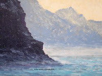
Misty Blue
Acrylic on Canvas Panel
16 x 20 in (40 x 50 cm)
Copyright 2008

In this edition of Orbisplanis Art Blog I’ll go through the steps I took to paint Today’s Image. It’s an acrylic coastal scene.

I completed this painting in four hours, which does not include varnishing. You do not have to follow these steps in the exact order to have a successful painting. In fact, you should do them in the order that suits you best so that the painting is your own. As Henri Matisse said, “creativity takes courage.” Please do not be either intimidated by that or think that I must be really slow—it takes as long as it takes you—no pressure!

Hour 1

Step no. 1 – Select your motif and style; I like to paint landscapes and coastal scenes, and the color and misty light in this photo caught my eye, so I downloaded it and printed it; I’m learning about how the Impressionists painted so decided to go for that.

Step no. 2 – Select your support; in the last Orbisplanis blog, I discussed how you can re-use canvases by painting over them with gesso, which is what I did on this previously painted 16 x 20 in (40 x 50 cm) canvas panel.

Step no. 3 – Select your color palette; with printed photo in hand I selected the following acrylics from my paint drawer in no particular order (remember--the printed photo may look different than it does on the computer screen)): Van Gogh warm grey, Grumbacher Payne’s gray, Grumbacher ultramarine blue, Grumbacher burnt sienna, Liquitex Basics dioxazine purple, Amsterdam greyish blue, Amsterdam sky blue light, Amsterdam Naples yellow deep, and Winsor & Newton Galeria titanium white.

Step no. 4 – Sketch the main elements on your support; for this painting there are only the few cliffs so I used greyish blue, which I diluted with just a little water, and painted them in loosely with a narrow brush (I prefer Natural Bristle brushes for my acrylics).

Hour 2

Step no. 5 – Paint the sky; I used Naples yellow and titanium white; I wanted to match as close as possible so I daubed the paint on in thick, short diagonal strokes.

Step no. 6 – Paint in the far mountains; I used a mixture of greyish blue and warm grey, which I painted on lightly and let some of the white of the canvas show through to lighten and give the look of distance and atmosphere; I tried to mimic the ups and downs of the peaks to resemble the photo.

Step no. 7 – Paint the mid-range mountains; these are closer to the viewer so they need to be darker than the far mountains; I used the same grayish blue but with more paint and daubed it on again with short diagonal strokes but left less white showing; again I tried to mimic the peaks in the photo.

Step no. 8 – Add dimension to the far and mid-mountain ranges; they may be looking a little flat and two-dimensional at this point, you can add depth and reality by scumbling over them lightly with Naples yellow, which adds the perception of light and shadow; I do this now as it spurs me on because it’s starting to “look pretty good” at this point and I need the encouragement even if it’s my own.

Hour 3

Step no. 9 – Paint the closest mountain cliffs; they are the focal point of the painting so you may want to think about how you’ll paint this before “diving in;” they are the darkest thing in the painting; in my mind’s eye I see a deep purple/deep brown, so I use a mixture dioxizine purple, burnt sienna, and Payne’s gray; it covers a big area so mix up a good blob of paint; paint it on thickly and heavily with multi-directional strokes and leave just a very few spots of canvas showing; leave the edges of the cliffs feathery but enough so they stand out from the mid-mountains.

Step no. 10 – Start on the water; I diluted Payne’ gray with water; loosely and lightly paint in the shadows of the waves starting at the “horizon” (of the water not the shore) and move closer in wave by wave; create depth by making the wave shadows that are more distant using narrow horizontal strokes and increase the thickness as you move closer.

Hour 4

Step no. 11 – Finish the water; this is the trickiest part; I used greyish blue, sky blue light, and titanium white for the water; since the light is coming over the far mountains on the right, the water needed to be lighter and with more highlights on the right side; first I used grayish blue in not-too-thin and not-too-thick horizontal strokes on mostly the left where the water is more in shadow but with a few strokes on the right; then I used sky blue light in relatively thick horizontal strokes—lighter in the distance and getting increasing dark as you move closer in and to the left.

Step no. 12 – Put finishing highlights on the water and near mountain cliffs; using titanium white that is very dry on the brush I scrubbed on the paint where the water meets the distant shore to add the look of misty, hazy distance; I scrubbed on dry greyish blue on the near shore below the dark cliffs to add mist there; finally I scumbled greyish blue lightly over the dark cliffs to add highlights and depth—you can eye-ball this so that the highlight add the depth that looks in keeping with the rest of the painting.

We're finished, and I like it.

Cheers!

Friday, December 12

How to Use Gesso


Today’s Image

In the Studio

Today's Image is Gesso. It’s that ubiquitous stuff that artists appear to take for granted. Not having been raised around art or the creation of art, this gesso stuff was interesting to me as I renewed my interest in art and painting. I didn’t even know how to pronounce it—was it GEH-SO with a hard G or JEH-SO with a soft G? Seems like a simple question, but you’d be surprised the number of hits it took on Google to find out (12). The winner was http://www.blogher.com/crossing-mediums-talk-writer-jennifer-mcguiggan-about-making-art-squam. This was after visiting Italianlanguageguide.com and weetoysoldiers.com (they use it to prime their toy soldiers before painting). By the way, it’s JEH-SO with a soft G as in “Jesse.”

I spent a little while researching the mystery, via Google of course, and found out a lot about gesso, and probably more than anyone cares to know including me. Seems it’s been around for a long, long time in the art world, but it’s had a rebirth of sorts with the advent of acrylics. Here’s what Wikipedia tells us:

Classic (my term) gesso is the Italian for "board chalk” (akin to the Greek word "gypsum”), and is a powdered form of the mineral calcium carbonate used in art. Gesso was traditionally mixed with animal glue, usually rabbit skin glue (what is that?), to use as an absorbent primer coat for panel painting with tempera paints. It is a permanent and brilliant white substrate, as long as it is used on wood or masonite. This mixture is rather brittle and susceptible to cracking, thus making it unsuitable for priming canvas. In Geology, Italian "Gesso" corresponds to the English "Gypsum", as it is a calcium sulphate compound.

Modern acrylic "gesso" is actually a combination of calcium carbonate with an acrylic polymer medium latex, a pigment and other chemicals that ensure flexibility, and ensure long archival life. It is sold premixed for both sizing and priming a canvas for painting. While it does contain calcium carbonate (CaCO3) to increase the absorbency of the primer coat, Titanium oxide or titanium white is often added as the whitening agent. This allows the "gesso" to remain flexible enough to use on canvas. High concentrations of calcium carbonate, or substandard latex components will cause the resulting film to dry to a brittle surface susceptible to cracking. Typically, a canvas should be sized prior to being gesso'd as a sizing coat will sink into the substrate to support it as opposed to a gesso coat which is just put on top of the substrate.

Who knew? I even added Gesso to the Artists Factoids section of the Orbisplanis Art Blog-see the right-hand column.

Anyway, as I read about its many uses, I experimented with it. Its main use, of course, is as a primer for canvas. Most store bought canvases are already primed so they don’t really need it. I think some artists like to apply even if it’s not needed because they just enjoy the process.

There are two reasons I like gesso:
  1. I like the rough texture you get when you paint it on the canvas or whatever support you’re using. You can get as fine or as coarse a texture as you like just by how carefully or sloppily you apply it-the more sloppy, the coarser. A coarse texture provides a way to adjust how the paint sits on the surface, and you can get all kinds of different effects, which I like. It lets you emulate different artists’ styles. The acrylic I’m working on now has a very coarse texture, which complements both the motif, a seascape, and the style, which is a very loose, almost abstract, brushstroke that works well, I think, with the distant and misty view I’m trying to achieve.
  2. Number 2, and I guess you can say the main reason I like gesso is because you can use it to re-paint your canvas at any time: whether you’re in the midst of your masterpiece or even if you have already completed it, varnished it, and hung it on the wall—you can still apply gesso to it. Now partly it’s economical, you can use and re-use your canvases over and over and over again. But mainly it takes the pressure off of me not to make any mistakes. That is, it allows me to just relax and paint away, knowing that I can fix whatever I don’t like whenever, even if I’ve ‘finished’ the painting.

If only there were Gesso for your life.

Cheers!

Tuesday, December 9

There Will Be Art in (Houston) Airports!

http://www.chron.com/life/photogallery/Public_art_in_Houston.html

Today’ Image

Rather than an actual image, Today’s Image is a link to a series of photos on the Houston Chronicle website. I hope you take a minute to click on it and view them.

Back in September of this year (2008) as we began some of our travels, I mentioned in the Orbisplanis Art Blog (There Is No Art in Airports) that I was disappointed to find next to nothing in the way of art at any of the airports that we usually pass through. Those are Bush Intercontinental (IAH)-Houston, Los Angeles International (LAX)-Los Angeles, Hobby (HOU)-Houston, and Ronald Reagan National (DCA)-Washington, D.C. We also recently traveled through Tulsa International (TUL)-Tulsa, OK, and found the same thing—no art.

It’s not that I have particularly high expectations about art or anything else, it just seems to me that because so, so many people pass through airports in order to travel, there should be at least a little accommodation on this. When you’re at one of these airports (or actually any airport in the world) you usually have to walk an extraordinary distance: from departure ramp to baggage check to ticket counter to security check to moving sidewalk to shops/newsstands/restaurants to boarding gate. It’s a utilitarian journey through most likely dull public architecture and government financed structures with little or no human aesthetic. Even if the airlines have tried to spruce up their immediate environment around the departure gates, in my opinion there is nothing to show for it in the way of art (Before you email, I know there must be airports where this is not the case, but I haven’t been through any—Charles De Gaulle in Paris, maybe?).

Anyway, someone else must have noticed this, too, at least in Houston. I’m very happy to read about several public art projects coming in 2009—and two of them are at our airports, at Bush and at Hobby! An article in the Houston Chronicle details the two works. Bush will receive decorations for two large columns in one of the newer terminals in the form of colorful beaded designs representing world art. Hobby will get several large glass panels for a pedistrian bridge that abstractly show our area from an overhead satellite view.

This is very cool and good news. I’m proud of the art groups and alliances, as well as the airport authorities, in Houston who helped make this happen. Thank you! I hope LAX, DCA, TUL, and other airports worldwide take up the call.

In the Studio

I’ve been out of the studio for several weeks working on mandatory projects, so I am looking forward to getting back to my acrylic (or pastel) painting. Not sure what I’ll work on next, but that’s part of the quest, isn’t it?

Cheers!

Saturday, December 6

A Book About the Museum of Impressionism in Paris (circa 1965)


Today’s Image

In the Art Library

It’s been a few weeks since I’ve been in the Art Library at Orbisplanis Art Blog, so that's where today’s blog finds us. On a recent visit to Washington, D.C., that I blogged about previously, we visited several used book stores in the Adams Morgan neighborhood. Adams Morgan is an eclectic neighborhood just east of the Duke Ellington Bridge, and by all appearances is a happening place. It was a Saturday morning, and people were really enjoying the refreshing fall weather at coffee shops and outdoor markets. The old neighborhood includes restaurants, and row houses, and used book stores, which I enjoy roaming around. Today’s Image is a street scene in Adams Morgan.

Anyway, we found one that was full of all kinds of old books including art books, which I always look for. I found a small book I think is noteworthy in that it has a lot of information and color pictures of some of the most famous paintings in the world all in a 4 by 6-in. (10 by 15 cm.) format and 80 pages.

Entitled The Museum of Impressionism in Paris, the book (actually it’s a booklet) is part of a series called the Little Library of Art published and edited by Fernand Hazan in 1965. Others in the series are listed on the back cover and include books on African Tribal (art), Dali, Klee, and Picasso, just to name a few. It has a brief overview that talks about the history of how and where the Impressionists’ paintings were exhibited at museums from the late 1800s through the mid-20th century and current to 1965. It also provides an interesting introduction to the era of Impressionism and how the Impressionists came to be a force in modern art.

The second part of the book, starting on p.17, is a section called The Painters and Their Work and lists all the Impressionists alphabetically from Bazille to Van Gogh. There is no table of contents, so I found it fun to thumb through the pages to see who all was included. They are listed with any of their paintings included in the book (and all in color):
  • Jean-Frederic Bazille – The Family Reunion
  • Eugene Boudin
  • Gustave Caillebotte
  • Mary Cassatt – Mother and Child
  • Paul Cezanne – The House of the Hanged Man, L’Estaque, Still Life with Onions, The Blue Vase
  • Edgar Degas – At the Races, Absinthe, Dance on the Stage, The Laundresses, Woman Combing Her Hair
  • Theodore Fantin-Latour – Narcissi and Tulips
  • Paul Gaugin – Tahitian Women, The White Horse, Arearea
  • Eva Gonzales
  • Armand Giullaumin
  • Johan Barthold Jongkind
  • Edouard Manet – Le Dejeuner sur L’Herbe, Olympia, The Fifer, The Balcony, Portrait of Irma Brunner
  • Claude Monet – Regatta at Argenteuil, Bridge at Argenteuil, Rouen Cathedral at the Tour D’Albane, Morning Effect, Women with Sunshade
  • Berthe Morisot
  • Camille Pissarro – Chestnut Trees at Louveciennes, Entrance to the Village of Voisins, Red Roofs
  • Odilon Redon
  • Pierre August Renoir – Hillside Path in Tall Grass, The Swing, Moulin de la Galette, Gabrielle With a Rose, Torso of a Woman in the Sun
  • Henri Rouart
  • Henri Julien Rousseau – The Snake Charmer
  • Georges Suerat – Le Cirque
  • Alfred Sisley – Boat During a Flood, Snow at Louveciennes
  • Henri Toulouse-Lautrec – Woman with Gloves, The Clown Cha-U-Kao, Seated Girl-Back View
  • Vincent Van Gogh – The Restaurant de la Sirene, The Church at Auvers, Self Portrait, Portrait of Dr. Gachet

What I like about this little book, in addition to the 42 color pictures of the beautiful paintings, is that it’s so easy to use as a reference for all of these great Impressionists. You can keep it right there on top of your art drawers and boxes and near at hand to look at while you’re painting for inspiration. I hope you can find it in a used bookstore, too, somewhere or maybe on eBay.

Cheers!

Monday, December 1

Interest in Oil Painting


Today’s Image

I enjoyed a long Thanksgiving holiday weekend in the USA, which included travel to the mid-American city of Tulsa, Oklahoma. While there, we were shown around town, which included seeing several old buildings which date from the 1920s and 1930s. The main feature of many of these buildings is their Art Deco architecture and style. Art Deco is the style and form from that era that touched design elements from artwork to architecture to furnishings. Art Deco featured sleek, simple lines, many with squared (or rounded) prominent corners to imply movement, and sometimes shiny surfaces and obvious ornamental details for a modern (also called Moderne) look. It was somewhat surprising to see the number of Art Deco buildings in Tulsa, which is a medium-sized city (metro area population 840,000). In a tribute to urban preservation in Tulsa, most of these buildings are still in good-to-excellent condition. Today’s Image is a shot of the façade of a Native American arts and crafts trading center.

Renewed Interest in Oil Painting

If you are a regular viewer of Orbisplanis Art Blog, then you may recall I prefer acrylics over oil paints for very good and practical reasons. It’s not that I dislike oil paints or the beautiful results achieved from artists from the 17th century to the present. To the contrary, I am quite satisfied with my several oil paintings completed since renewing my interest in painting last year, and think they are some of my best.

No, I prefer acrylics over oils for these practical reasons: acrylic paint is odorless and acrylic paint is fast-drying.

My “studio” is in the house, not in a separate building or in a distant, out-of-the-way corner. My studio is in a room that has the largest window and best light, although the window faces west rather than north. It also happens to have a tile floor and is air-conditioned and central-heated.

Oil paint, and its friends turpentine and even “odorless” mineral spirits (OMS), can make a house smell like, well, an artist’s studio (see my blog on OMS). Nothing wrong with that except it can permeate the entire house. With acrylics I can paint away the day odor free.

In addition, oil paint takes an extraordinarily long, long time to dry in my climate, which is known for its abundant humidity three out of four seasons. Humidity and oil painting do not mix well, at least in my opinion. I know several of you would argue that great oil paintings have been rendered throughout the great art periods in all kinds of climatic conditions including humidity. Of course, that is true. However, I’m not aware of any great artists who lived and painted in a semi-tropical (not to mention un-air conditioned) climate. Many, if not most, of the greatest oil painters lived in temperate Europe, North America, or Asia, but not in the parts with extreme heat or humidity though.

But I digress. So, my oil painting period is relegated to the Winter season, which is fast approaching (in the northern hemisphere). During Winter I can set up a second “studio” part-time in my garage (car park), which is in a separate, although un-air conditioned and un-heated space. During this time I renew my interest and skill with oil paints. Many artists are of the opinion there is a superior and “certain look” with oil paintings, and others have a bias for acrylics--just link to the Oil Painting, Acrylic, or Café Guerbois channels on wetcanvas.com and you’ll see. However, I am glad to be able to enjoy both mediums if only one or the other during certain seasons, and I am looking forward to oil painting again.

In the Studio

Before moving part-time to the garage during Winter, I still have work to do on several acrylics I have planned in my indoor “studio.” I’ll keep you posted with updates.

Cheers!

Monday, November 24

A Limited Palette with Acrylics?


Today’s Image

In the Studio

Last week I finished an acrylic I worked on for a couple of days. It was not painted en plein air or from a reference photo as I don’t live anywhere near a desert nor have I taken a photo like this. The scene is totally from my mind’s eye, and is actually a compiled memory of both my residency and travels in the American Southwest. Although I titled it Deming Spring, it is not painted from anything real in Deming, New Mexico, USA; it is, however, a painting of an imagined spring morning there. My palette was Grumbacher's cobalt blue hue, cadmium yellow medium, cadmium red medium, burnt sienna, Payne's gray; Winsor & Newton's Galeria viridian, titanium white; Winsor & Newton's Finity olive green; and Liquitex's alizarin crimson. It’s Today’ Image.

My Opinion on Color Palettes

Before moving on to other art topics in upcoming Orbisplanis art blogs, I wanted to wrap up with a discussion of my opinion on color palettes.

When I renewed my interest in art in 2007, a color palette was not near the top of my interests—in fact, it wasn’t even on the list. As previously mentioned, not until I got interested in pastels (and later acrylics) did I even think about a color palette. With pastels I learned that most artists use a full array of pastel colors or at least as many as they can afford. In my reading and research on pastels, I don’t recall seeing the term palette used much, if at all, rather the discussion is more around how to mix and blend (optically and physically) as many pastel colors as you have at your disposal to achieve your goals. I’m guessing that the term palette was connected more with oil painting (using a wooden palette with a thumb hole to mix the paint) than with pastels. The Impressionists and other artists of their era used pastels in addition to oil paint. This was long before acrylics were invented, of course.

With acrylics I have gone from one extreme to the other I guess you could say. That is, I was initially drawn to acrylics not only for their speed and convenience but also because of all those colors! When you shop for acrylics you are bound to get hooked on all those colors hanging there on the racks. Depending on the brand, you have dozens of choices in what seems like every possible color. When I started painting with acrylics, I first bought the suggested palette of colors. A consensus of sources seem to agree on the ones I mentioned last blog, give or take one or two--cobalt blue, ultramarine blue, Paynes’ gray, viridian, burnt sienna, yellow ochre, cadmium lemon, cadmium yellow, orange, cadmium red, permanent rose, violet, and titanium white. I bought them all and more. It became like a game whenever I entered an art supply store—which color will I buy next? I would think of all the scenes I could paint with those colors, which I’m sure is what the marketing people at the acrylic paint companies intended. I haven’t counted but I must have at least 75 colors although some are duplicates.

However, as I kept researching art and artists I learned more about limited palettes. I learned that Claude Monet at one time used only cobalt blue, cadmium yellow medium, cadmium red, viridian, alizarin crimson, burnt sienna, and titanium white, and he seems to have had a pretty successful career :-). It’s highly likely, however, that there were only a few colors available then due to high cost and limited technology. I also read that the best way to learn about colors is to mix them yourself using a limited palette.
As I said, I went to the other extreme and for a while used only a limited palette. If it was good enough for Monet, then it’s good enough for me I reasoned. I did learn something about mixing colors, which is good. But maybe it’s my relative inexperience, or maybe it’s the way I mixed colors, but my paintings with a limited palette all seem to somehow look the same. Not the same motif, but they all have similar colors that make them look like they came from the same artist. Maybe that’s what the great artists did, but I found it disturbing that a desert landscape and a seascape looked oddly the same.
So today anyway I am of the opinion that I (and you) as the artist can do whatever I (you) please. You want to use a limited palette just like the Impressionists? Be my guest! You want to buy all the acrylic paints at your art supply store? Go ahead! In fact, you may need to. I discovered that you can only buy the color 'hot pink' (Winsor & Newtion Galeria Opera Rose). There is no combination of other (acrylic) colors you can mix to achieve it. So there!
I’m advocating experimentation, which I believe is the cornerstone to creativity. You may just become that next great artist who changes the art world for the next hundred years.

Cheers!

Thursday, November 20

Using a Color Wheel to Paint


Today’s Image

In the Art Library

In the last few Orbisplanis blogs I’ve been discussing color palettes and wanted to share a resource with you. It’s not specifically about color palettes per se, but it is a resource I found extremely useful. I mentioned last blog when I was experimenting with pastels what I thought I needed was information on mixing or blending pastel colors. As it turned out, I found that many artists discuss different methods of painting with pastels; some talked about blending (with your fingers or a torchon, for example), but others said you’d be better off using all the pastel colors available to you for optical (rather than actual) blending. Others instead recommended scumbling, masking, and using fixatives during the process.

It can almost go without saying that I initially found pastels somewhat difficult, and still do. However, my search for information on color mixing led me to the book I mentioned last blog: The Acrylic Paint Color Wheel Book by John Barber (I mistakenly recorded the title with ‘color wheel’ as one word, but it’s two). It was this book that made me move from pastels to acrylics.
If you’re an artist who is always looking at the Art section in bookstores, used bookstores, art supply stores, and the like, as I am, you may have seen this book. I think it stands out from many of the art reference and how-to books because it has an actual Color Wheel built right into the cover of the book. It’s a pinwheel with a rivet, and you can turn a tab on the cover to reveal the blended colors in slots without even having to open the book. Cool.

The colors on the color wheel are the de facto palette for what’s provided in the book, which is exercises for you to complete to learn all kinds of techniques using acrylic paint. Last blog I listed the colors, and they are: cobalt blue, ultramarine, paynes’ gray, viridian, burnt sienna, yellow ochre, cadmium lemon, cadmium yellow, orange, cadmium red, permanent rose, and violet. I forgot to mention that the color wheel didn’t include white, but white is used as a color in some of the exercises, so I recommend using titanium white, which is used almost universally.

I found the book very useful in learning the basics of mixing and using color. I don’t know if it was getting to turn the color wheel that made me want to experiment and do many of the exercises, or what, but it really helped me, and it might help you, too.

In the Introduction there is a relatively brief but comprehensive discussion understanding color, the basics of the color wheel (primary, secondary, tertiary colors, etc), and terminology so you understand the difference between hue, intensity, and tone. Confession--I still get confused and have to reference it.

There is a section called How to Use This Book, which tells you exactly how to use the color wheel when doing the exercises. It tells you the different sections on the pages of the exercises and how to use them: the finished painting, what you will need, color mixes, step-by-step, techniques, and artist advice and tips, to name a few.

There is a section on Materials and Equipment, which goes into everything you need to not only get started, but to be successful: paints, supports, brushes, easels, etc.

There is a section Basic Techniques, which covers different painting techniques for painting broad areas, fine detail, and stippling, for example. It also talks about color mixing, glazing, washes, overlays, opacity, and on and on.

The majority of the book, however, is devoted to the eight projects included. This is the ‘meat’ of the book, I think, and the one you’ll find most useful. There is a nice variety of projects that covers most popular styles and subjects, and will give you practice in trying new things. There’s a still life, architecture, a seascape, a landscape, a floral, a figure, and wildlife. And before you begin the exercises, there is a Gallery with examples of beautiful acrylics to get you inspired.

I recommend The Acrylic Paint Color Wheel Book for anyone interested in learning about using acrylics or who wants to improve working with color.

In the Studio

Well, I got inspired just looking at the color wheel book again, and began and almost finished my next acrylic alla prima (see Artist ‘Factoids’ in the right-hand column). I’ll post it when I’m done.
Cheers!

Tuesday, November 18

Learning About Color Palettes


Today’s Image


Continuing last blog’s topic of color palettes, I’ll tell you how I progressed in my color education since renewing my interest in art and painting in the summer of 2007. The discussion is mainly about my interest and journey in acrylics and how I progressed in that medium although I also made color choices with pastels and oils, too. Today's Image represents mixing colors with a color palette.

In past Orbisplanis blogs I told how starting with graphite and pen & ink drawings, I then tried pastels before moving to acrylics (and some oil) painting. When I first worked with pastels, I learned about their unique properties and characteristics mainly through trial and error. If you’ve painted with pastels, then you know that, more often than not, you really need a pastel of a specific color rather than mixing or blending. Of course, artists do blend, mix, and scumble pastels all the time to achieve specific colors. However, you may have noticed that sets of pastels come in no less than boxes of 12 and more often they are offered in sets of 24, 48, 64, 128, etc. These boxes are your pastel color palette although you may only use a subset of them for a particular piece.

At the time, I acquired several boxes of pastels, one with 64 colors. While experimenting with pastels to achieve pleasing colors, what I really needed was something that would help me with mixing colors. One day while at Barnes & Noble I quite unexpectedly found this: The Acrylic Paint Colorwheel book. At the time, I did not realize this was but one in a series of ‘colorwheel’ books that were available not only for acrylics but also for pastels, oil, and watercolor. Had I known there was also a pastel ‘colorwheel’ book I would have looked for it. But I was glad to find a book that provided a simple formula for mixing colors, albeit acrylics, and I bought it with the idea that I could use the same principles for pastels, which I did.

But I digress. Long story short, after a couple of months of pastel painting using the colorwheel book, I was also reading it and all about acrylics. I decided to give acrylics a try. The cover of the book is actually a colorwheel, which is a recommended palette. Without using acrylic paint brand names, only the generic and traditional names of colors, the palette is: cobalt blue, ultramarine, paynes’ gray, viridian, burnt sienna, yellow ochre, cadmium lemon, cadmium yellow, orange, cadmium red, permanent rose, and violet.

Using this book, I also learned the difference between hue, tone, and color, and a whole lot more. Next blog I will review The Acrylic Paint Colorwheel book in In the Art Library.

Cheers!

Friday, November 14

What is a Color Palette?


Today’s Image

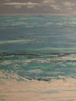
The last few Orbisplanis blogs were about painting from reference photos, so I wanted to show you one of my acrylics that I completed late last month ( October, 2008). I mentioned this acrylic a few blogs ago, but had not posted it. I painted it from a reference photo I found online at a travel website if I recall. It’s of the surf somewhere in the Caribbean and to repeat, my palette was: Reeves Cerulean Blue, Amsterdam Sky Blue Light, Van Gogh Greyish Blue, Fundamentals Cadmium Blue Green Light Hue, Liquitex Basics Light Aqua Green, Grumbacher Payne’s Gray, and Winsor & Newton Galeria Titanium White as my palette. I used the same process I discussed in the last blog except that I was not the photographer. Anyway I wanted to post it for you, and it’s Today’s Image.

Color Palettes
If you read art books or take art classes or just like to experiment with color mixing, you’ve probably thought about your paint color palette, or maybe you haven’t. If you’re an artist who believes that ‘anything goes’ when it comes to art; that is, art is in the eye of the beholder, then you may not have a palette at all. If every canvas is a new beginning, then you may not think of a palette except in the context of your immediate artwork.

But I’m getting ahead of myself. I looked up a definition of color palette and will share these two.
One is one from Answer.com that is very traditional: a board, typically with a hole for the thumb, which an artist can hold while painting and on which colors are mixed; the range of colors used in a particular painting or by a particular artist, also known as a limited palette.

In the digital age, it can be much different, so here’s the other from PC Magazine: also called a "color lookup table," "lookup table," "index map," "color table" or "color map," it is a commonly used method for saving file space when creating 8-bit color images. Instead of each pixel containing its own red, green and blue values, which would require 24 bits, each pixel holds an 8-bit value, which is an index number into the color palette. The color palette contains 256 predefined RGB values from 0 to 255.

I Googled ‘color palette’ and received 2,370,000 hits—can there really be that much information on color palettes? Apparently so. And there’s a whole range of discussion on the subject.

I found this basic discussion on About.com, which gets back to basics by asking, “what colors do you need to start painting with acrylics?” It then gives you nine colors to start with and a primer on why each one is good: cadmium red medium, pthalo blue, cadmium yellow medium, titanium white, mars black, burnt umber, pthalo green, orange, and purple. I am not advocating this palette at all, but just wanted to give you what someone (an artist, I presume) thinks you should start with.
At the other end of the spectrum (no pun intended) is the digital side of color palettes. As I said, I found 2,730,000 hits when I Googled ‘color palette.’ The no.1 hit is Color Palette Generator and when you click on it, you enter the world of digital color palettes, used more often than not, by professional graphic designers for on-screen visual effects and websites.
The site is DeGraeve.com and on the site if you click About, it says: “DeGraeve.com has focused on developing tools to solve specific "problems." Sometimes that problem is generating an ASCII art version of your face. Other times the problem involves divining a color palette from an image or making your own business cards.” What?
What I found it to be (and you may be interested, as I was, to play around with it) is a tool that allows you to select an image, and the Color Generator will provide the digital color palette of the image. Cool. Try it, and appatrently there are a lot of other color generator tools out there, too.

While this tool is for digital palettes, I found it helpful for regular old ‘analog’ colors (and regular artists) in that you can eyeball-match these colors and attempt to mix them using the basic palette provided on About.com or other basic color palettes as well.

In the Studio

It’s time for me to select my next piece, which I will ponder this weekend, and let you know next blog or two what I’ve decided.

Cheers!

Tuesday, November 11

How I Paint From a Reference Photo


Today’s Image


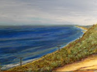
Last blog I wondered if the Impressionists would have used reference photos, and I decided that, yes, they would have, considering photography was brand new in that era. I also said I’d be discussing my own process for painting from a reference photo, so here goes. Today’s Image is my acrylic painting—North of Goleta-- painted from the reference photo overlooking the Pacific (north of Goleta, CA, and shown in my last blog).


I said I wouldn’t really call it a process (my painting from a reference photo, that is), but more like working in the moment. But, first things first. When I began drawing and painting again in 2007, I started by looking for interesting, inspiring, art-worthy subjects that caught my eye in photographs in magazines, brochures, and online mostly. I just mainly wanted to draw or paint subjects that would help me to renew and sharpen my drawing and painting skills. Most were paintings I did for my own education and enjoyment.

After I decided I might want to try to show my artwork at shows, festivals, galleries, or whatever, I decided to ask a professional artist for advice on reference photos. His advice: if you’re going to submit your artwork in shows, etc, you, as the artist, should also be the photographer of the reference photo used for the painting. Otherwise, your rendering would actually be a copy of the image as seen and photographed by someone else. I believe the key point is that if you submit artwork for ‘public’ viewing, it should be entirely your own—your imagination, your subject, your viewpoint, and your style and rendering.

That said, you do have a great deal of latitude in the outcome of your work. If you took the photo yourself, you were obviously there (at least physically, let’s hope!), so you also have a lot of ‘information’ about what was happening in the moment that may not show in the photo. For example, you know the time of year and time of day and what the day (or night) lighting was like even if the photo shows something different. You may also be aware of the dynamics of the situation, and can add, if appropriate, potential action or anything else not apparent in the photo. So remember you have a lot of freedom when painting from a reference photo.

So what do I do?
  • First and foremost, select your reference photo carefully as this determines the motif for your painting.
  • Second, and you probably have already decided this, choose the medium (and I’m assuming either acrylic or oil, but could also be pastel or other) and support (canvas, linen, paper, etc).
  • In this digital age I’m assuming you’re using your digital camera and printer, so scan or download your photo, then print it out in as large a format your printer allows.
  • Next carefully study the photo to determine if it looks the way you remember or if you need to mentally (or digitally) crop the photo to better focus on the subject or subjects. Your art instincts should tell you where your viewer will enter and move around the painting.
  • This is important—be aware that the colors on your computer screen and/or the colors printed out on your printer may or may not match what you viewed and experienced, so decide what, if any, changes you want to make now.
  • After considering the color effect of the photo, select your palette; you may already have a standard one you always use no matter what the subject, or you may want to (or have to) add/ subtract/change hues as you deem necessary for what you want to portray.
  • Next, think back to the time or even the moment in which you took the reference photo—what were you trying to capture in the photo; how were you feeling or what was your state of mind; think about your subject—if inanimate, how was it situated (lighting, perspective, etc), if a living thing, what was it’s demeanor, etc? Determine what in the photo makes it art-worthy for painting.
  • Then sketch the major elements on your support (as you normally would).
  • Now, remembering the time at which the photo was taken and using your natural or a selected style, paint deliberately and boldly from the reference photo; keep in mind any element, or elements, you want to emphasize or de-emphasize; likewise, determine if you want the color values of your painting to match that of your reference photo, or do you want to change them to be more or less true to the moment?
  • Your artistic vision for your artwork from a reference photo will be realized—so that's it, congratulations!

By the way, in North of Goleta, I painted the sky as it appeared in the printed photo rather than on the computer screen, which more closely matched what I saw in person when the photo was taken. On the computer, the sky in the photo appeared a much brighter blue than I remembered. As I recall, the sky was a bit more pale and hazy especially on the horizon; so that is how I painted it.

Cheers!

Friday, November 7

If Impressionist Painters Had Used Reference Photos in Plein Air Paintings


Today’s Image

I’m following up on an In the Studio segment from one of my recent blogs. It’s the one where I was talking about finishing my acrylic of a view overlooking the Pacific Ocean. I mentioned I ‘finished’ it several times but may also ‘finish’ it a few more. Today's Image is a photo of the scene.

I believe almost everything I read about plein air painting and plein air painters. If you follow this blog, then you know the Impressionists, with their 19th-century breakthrough of painting out-of-doors, are some of my most favorites. I’m pretty sure plein air painting does provide some special something that can only be realized ‘before your very eyes’ so to speak. The old saying, “you just had to be there,” is probably true in some respects, but don’t you think that a good, or especially a great, artist can capture a scene in the studio at a later time after having seen the subject firsthand? I do.

I have read about some of the Impressionist painters’ difficulties with outdoor climate, such as storms brewing up at the coastline and heat/cold/fog, while on the scene painting in plein air. But look at it this way, they were lucky enough to be living in a fairly temperate climate for the most part. We’re talking Parisian suburbs, Normandy coastlines, and sabbaticals to London and Tuscany. I’m sure the summers could be hot and the winters cold, but for the most part it was pretty darn nice with long springs and autumns for plein air painting. It’s no wonder their landscapes are magnificent.

I also discovered through reading that the Impressionists were greatly influenced by the camera and photography. Photography was new for the period. They used its viewpoint to their advantage, which gave them new perspectives in viewing subjects and cropping their artwork at the edges. Very new and high-tech for the time, and if you’ve read anything of the era, it was not well received. But now the Impressionists are regarded as Masters. Time certainly has a way of changing things doesn’t it?

But I digress. What about the rest of us today? There are a lot more of us now (1.5 billion vs. 6 billion), and we’re living all over the planet due to conveniences such as heating and air conditioning in places that would have been considered near uninhabitable in 1874. I maintain that if the Impressionists had had digital cameras or cell phone cameras, they would have used them.

Regarding my acrylic painting overlooking the Pacific, I initially reported that, “I like it so far and think it will turn out fine.” I had trouble getting the water to look right in addition to the perception of depth. This was because of the near foreground that overlooked a steep cliff while at the same time a hill rose to the right and simultaneously the viewer could see up the coastline for a distance not to mention the far horizon on the ocean.

Next blog I will tell you about my process for painting from a reference photo, although I hate to call it a process; it's more like working in the moment. Whatever. I think every painting (or creative endeavor) you undertake is unique in the way you come to it, at least mine are. I'll show you the 'finished' painting, too.

Cheers!

Tuesday, November 4

Art Festival Time!


Today’s Image

Somewhat unexpectedly on our final day in the Washington, D.C. area, we ran across a fall Art Festival in the streets of suburban Bethesda, Maryland. We were on our way to more sightseeing when we saw the banner on Wisconsin Avenue. It was the Bethesda Row Arts Festival, the 11th annual. Just shy of 200 artists were showing their works including all kinds of painting (oil, acrylic, pastel, encaustic), scultpture (bronze, steel, wood), ceramics, fiber, photography, and jewelry. A street scene of the festival is Today’s Image.

It made me think again that showing artwork at festivals around the country is one of the main ways artists have to sell their wares and get their work and name out before the public. It’s not only art, it’s a business and a lifestyle. I talked to several of the artists who said other than showing their work in a local gallery, if that, a festival is their main sales opportunity.

Many artists continually apply and are accepted to festivals that are happening year 'round, primarily in the spring and fall. They own or rent the street booth necessities, such as booth dividers, tents, tarps, hangers, tables, stands, etc. Not too far from the festival you can spot the artists’ parking area, which is full of RVs, trucks, vans, and SUVs. Although many of the artists at any particular festival are from the surrounding area, a good many travel regionally and even nationally to take part in the larger festivals.

In a previous blog, I had mentioned there are websites devoted to helping artists apply to festivals with sites for uploading artwork and paying application fees. The sites have a listing of participating festivals and email artist members with lists of upcoming festivals and emails that list imminent deadlines.

I don’t know how successful the average artist is in terms of sales at these festivals. They must do better than break-even because so many artists participate, and these are just the ones who are accepted. At least as many do not make the jury cut.

One thing I, and many others, like about the art festival as a venue is that you have a chance to meet the artists and find out more about their passion and methods. The Bethesda Row Arts Festival was held on a crisp, clear fall weekend, and by all appearances looked to be a success as there were crowds of people, and I saw several transactions in the time we were there.

I myself had applied to two art festivals in my region and was ‘declined’ by one and ‘wait-listed’ by the other. However, the night before we left for our Washington, D.C., visit, the art festival that had ‘declined’ me emailed to say they had two booths that had come available at the last minute, and was I interested. Unfortunately I had to ‘decline’ the last-minute offer. My business-head said they were just trying sell every last single booth space, but my art-head was saying I was good enough to be accepted (if only at the last minute). The deadline for the next spring event is the end of this week, so I might just apply again.
In the Studio
I have spent this week cleaning up my studio and organizing my supplies once again. It seems to be never-ending. But I added another drawer to my rolling cart--that makes seven now--and I think I can find everything easier and faster. I'll let you know. We'll see.

Cheers!

Friday, October 31

Art and Architecture


Today’s Image

Continuing our trek of art venues in Washington, D.C. in this blog...Washington is full of museums as everyone knows, and we visit as many as possible on each visit, but we have only scratched the surface.

In addition to the National Gallery of Art and Sculpture Garden, we also had two other items on our list of ‘want-to-see.’ They were a visiting exhibit at the National Portrait Gallery (8th & F Sts. NW) and the nearby National Building Museum (401 F St. NW).

We had visited the National Portrait Gallery on a previous visit and spent an afternoon looking at the official portraits of each and every president from G. Washington to G.W. Bush. That in itself was worth the visit, but it’s only a fraction of artworks on hand at the museum, which also houses the Smithsonian American Art Museum. Needless to say, there is a lot to look at, and it will take many return visits to see the whole thing. But that day we came to see an exhibit of Ansel Adams’ photography and Georgia O’Keeffe’s paintings. If you read this blog, you know I am a big fan of Georgia O’Keeffe and other artists from New Mexico. I am familiar with most of her work, and some of the best (my opinion) was included in the exhibit. Many were on loan from the Georgia O’Keeffe Museum in Santa Fe, and which I had seen on a visit there. But several were from private collections, including oils of the hills around her Ghost Ranch home and her floral pastels, that I had not seen. Her landscapes continue to inspire. Some of the best of the photographs of Ansel Adams’ collection were interspersed with the O’Keeffe works so that you got a feel of what Southwest art was about in the first half of the 20th century. I don’t know if the exhibit travels anywhere else, but if it comes to your area, go see it.

Next on the list was the National Building Museum. It was just down F St. a couple of blocks. This may be one of those museums in Washington that you think you’ve heard of, but aren’t quite sure. That’s the way I was. Turns out it was actually renovated in 1987. It was originally the U.S. Pension Bureau Building from the mid-19th century, and I think I heard it was used as a union hospital during the Civil War, but I could be wrong. Anyway today it’s a beautifully restored building/museum dedicated to buildings and architecture. The main feature is the huge atrium that makes you say "wow” when you enter. The museum houses collections and exhibits, such as Frank Lloyd Wright and on the buildings of Washington itself (Washington: Symbol and City). The day we were there, an exhibit of student artwork on the revitalization of an old Washington neighborhood was on display, which shows how the museum interacts with current events. You’ve probably seen this museum and didn’t know it—it’s where the annual Christmas in Washington program is televised. You can’t miss the HUGE columns in the atrium, which is Today’s Image.

In the Studio

I guess I’m in productive mode this week. Since last blog I painted an acrylic from a reference photo that I’ve been wanting to do. It’s of the surf somewhere in the Caribbean with the crashing waves in the foreground and a view of the surf receding to the horizon. I used Reeves Cerulean Blue, Amsterdam Sky Blue Light, Van Gogh Greyish Blue, Fundamentals Cadmium Blue Green Light Hue, Liquitex Basics Light Aqua Green, Grumbacher Payne’s Gray, and Winsor & Newton Galeria Titanium White as my palette. I roughly sketched in the horizon and foreground waves, then started mixing the colors to the reference photo. I painted the foreground waves in bright titanium white, the mid-ground in light bluish-green, almost turquoise, and the horizon and sky in a light grey with aqua and white clouds. I like it and plan to finish it with a gloss varnish.

Cheers!

Tuesday, October 28

At the National Gallery of Art


Today’s Image

I’m continuing where last blog left off, which was in front of the National Gallery of Art at the Sculpture Garden. After we toured the garden, the next stop was the National Gallery itself. On a previous visit several years back, we spent a couple of hours on one of the floors going from room to room, but we honestly couldn’t remember what we had already seen before. Anyway that was before my renewed interest in art, and on this trip I knew what I wanted to see. And that was the Gallery’s collection of Impressionist paintings.

I had already consulted my DK Eyewitness Travel Guide for Washington, D.C. and knew there was an extensive collection to see. If you’ve been to the National Gallery, you know just how big it is. It’s impossible to see it all in a day, or even two days; it would take more like a week. The building itself is huge, I’m talking city-block huge, and there are two levels. There are also two buildings, the West Building and the East Building.

As I said, I was looking for the Impressionist paintings, and so not to waste any time, I went right to the Information Desk for directions. They don’t refer to it as Impressionist at the Gallery, rather it’s 19th-Century French. They’re located in Galleries 80 through 93 on the west end of the Main Floor in the West Building if you’re looking for them.

If you like the Impressionists, you will be glad you came. There are room after room (galleries) full of paintings of almost all the Impressionists you have ever heard of and probably some of which you had not heard. I especially enjoyed seeing the numerous paintings of Edouard Manet and Claude Monet:

Edouard Manet

  • The Dead Toreador
  • Still Life with Melon and Peaches
  • Plum Brandy

Claude Monet

  • The Cradle – Camille with Artist’s Son Jean
  • Rouen Cathedral, West Facade Sunlight
  • The House of Parliament, Sunset
  • The Japanese Footbridge
  • Woman with a Parasol – Madam Monet and Her Son
  • The Bridge at Argenteuil

Other favorites of mine:

  • The Ramparts at Aigues-Mortes by Frederic Bazille
  • Little Girl in a Blue Armchair by Mary Cassatt
  • Boulevard des Italiens, Morning, Sunlight by Camille Pissarro

There are, of course, many, many other beautiful paintings, and if you go online to the National Galery of Art’s website, you can see all of the above.

In the Studio

Last blog, I mentioned I had ‘finished’ my acrylic of the scene overlooking the Pacific Ocean again, but there was the possibility that it was not completely finished so I put it away for awhile. I did give it a name—North of Goleta—so it’s nearly finished. I’m pretty sure, though, that I have a little more work to do on it. I’ll let you know.


However, since last blog, I did start and completely finish another acrylic, which is Today’s Image. It’s a view from the sidewalk in front of the Sculpture Garden at National Gallery of Art on The Mall in Washington, D.C. I named it At the National Gallery. Unlike many of my acrylics, I used more water with the acrylic paint to give it a looser feel not unlike a watercolor. My palette was Liquitiex Basics Cerulean Blue, Liquitex heavy Body Viridian, Grumbacher Cadmium Yellow Light, Van Gogh Warm Grey, Grumbacher Burnt Sienna, and Galeria Titanium White.

Cheers!

Friday, October 24

Visiting the Sculpture Garden of the National Gallery of Art


Today’s Image

An unexpected find on recent travels was the National Gallery of Art Sculpture Garden. We ran across it while strolling on the Mall in Washington, D.C. I guess we knew it was there, but had either passed it by or forgotten it on previous visits. I’ve heard the Mall referred to as ‘the nation’s front yard,’ which I think is appropriate; it’s the place where thousands of visitors walk by and view our monuments and federal buildings.

That said, I suppose you can think of the Sculpture Garden as yard ornaments for the front lawn. It sits across the lawn from the “Castle’ of the Smithsonian Institute. You come across it quite unexpectedly, at least we did, and the sign invites you come in and walk down the gently curving sidewalk. It was a beautiful fall morning, and the leaves of several of the trees had begun to change to orange and red.

The sculptures are arranged so that you are guided to look first to the left at one, then stroll a little more, and you look to the right to view the next one. I didn’t know there were 17 sculptures in the garden until I looked it up later on the internet, and I don't think we saw every one. But we did see a good many that were impressive, if not beautiful and thought-provoking. Some of the sculptures were under renovation and not on display, but among the memorable to us in no particular order:
  • Aurora by Mark di Suvero– a huge steel structure with crossbars and beams that towers way overhead and is oxidizing as you look at it
  • Four-Sided Pyramid by Sol LeWitt– a large cascading pyramid of cubes that present the viewer with a symmetrical form of light and shadow
  • Cheval Rouge (red horse) by Alexander Calder – a large red multi-legged steel structure resembling a horse, although the red has faded to a pinkish orange
  • Cluster of Four Cubes by George Rickey – a tall bright stainless steel (it’s shiny) structure of four large cubes with shimmering finishes that are clustered around a pole. And it rotates.
  • House 1 by Roy Lichtenstein – My personal favorite and Today’s Image—it’s a complete optical illusion that you will spend minutes walking around and moving in and out to view to see how it works. What’s happening is that the sculpture is convex and also angled so that the main corner of the house appears to come forward or recede depending on your angle of viewing and distance from the sculpture. Very intriguing.

We were on our way to the National Gallery of Art when we found the Sculpture Garden, and were very glad we did.

In the Studio

A few blogs ago I was talking about my acrylic of a view of the Pacific Ocean from a cliff overlooking it. Well, I finished it after several fits and starts. It was one of those works that you finish, and finish, and then you finish it again, and then you finish it a third and fourth time. Well, I think I ‘finished’ it again yesterday. At least I put it away for now and called it finished. I did give it a name, which usually for me means that the end is near.

I didn’t have any particular trouble in painting it, but I wasn’t happy with the way the water looked and re-did it several times to try to get the depth, the reflections, and the wave action right, not to mention the correct tones (I did add Liquitex Heavy Body Ochre over the Grumbacher Ultramarine to make a believable color in the shallow water near the shore). I also had some trouble getting the depth perception right. The view is from a cliff looking at once down a steep hillside but also way off in the distance to the right, and there is a hillside that ascends on the right. After writing that description, no wonder I was having a bit of trouble. But I added shadows to the foreground, some highlights to the vegetation on the hillside, and ‘blued-up’ the horizon to make it recede. So I finished it again, for now anyway.

Cheers!

Tuesday, October 21

Hotel Art


Today’s Image

I was fortunate to be able to do some more travelling this month especially with the great autumn weather in the US. As I had previously remarked in an earlier blog about there being no noticeable artwork apparent at airports in which I pass through, I’m sad to report that is also the case at Ronald Reagan in Washington, D.C. There may be a statue or sculpture standing around somewhere, but if there were, I missed them among all the other signs, directions, warnings, and the Metro. I wonder if there is artwork at the Charles De Gaulle Airport in Paris?

Whatever. On this trip I decided to look and see what kind of 'art' was hanging at my hotel, if any. I was pretty sure there would be some kind of art there. I only began to notice artwork during the last year as I began to draw and paint again, and I now try to notice what someone else has chosen for my viewing pleasure.

My assumption is that it’s all business at hotel chains; that is, some artist somewhere (or their agent if they have one) had enough business sense to figure out how to make some money. I assume that almost every painting, print, photo, poster, etc. at hotels is mass produced, so that you see the same landscape or abstraction whether you’re in Maine or Montana.

I Googled ‘hotel art’ and ‘art in hotels’ and got a few hits. One was Overstock Art with the lively tag line of “Hotel Art – Get Inspired!” Hmmm. If you provide contact information, they’ll get in touch about their ‘hotel art program.’ I was surprised to see you can order by artist, by motif (landscape, floral), by style (Impressionist, Surrealism), and by size. There was also Art-Impact, which has “a tool for specifying and procuring artwork while closely monitoring the pulse of art and innovation.” Art-Impact lets you search by featured artist and browse their portfolio; it even offers special requests, which I assume meant they could accommodate artists not on their list. They seem to have something to fit every need and, if I’m not mistaken, it sounds like every piece of art is one-of–a-kind original, although that may not be in every case. If so, then maybe you won’t see the same thing in Bangor and Butte.

For Today’s Image, I’m showing you a sample of the artwork at the hotel (which will remain nameless) where I stayed. All the artwork in the lobby and at least in the hallway on my floor was in this same abstract style. It’s pleasing on some level. I like the bright color, but what is it—a canyon, a pelvis, what? Ah yes--in the eye of the beholder. I don’t know if it's the same style on other floors as I didn’t bother to look. The lobby and hall art was different and better, in my opinion, than the couple of pieces that hung in my room anyway. They were so bland that I can’t remember much about them—an abstract floral or something.

So I’m thinking, you get what you pay for as always. If you’re staying in a chain hotel, you get chain artwork; if you stay in an upscale resort, you get one-of-a-kinds, maybe.

The good thing is, at least they are trying, and I thank them for that. As for the artwork in my hallway, I think the EXIT sign adds something to the composition, don’t you?
Cheers!

Wednesday, October 15

From Corot to Monet


Today’s Image

I guess you could say I’m into visiting art museums recently. If you’re a regular viewer of Orbisplanis, then you know I returned from Southern California not long ago after visiting a slew of art galleries and museums from Los Olivos to LA.

I don’t think I mentioned that I am also fortunate to have some of the finest art museums in the country in ‘my own backyard.’ Not literally, of course, but in Houston. I had been planning all summer on visiting the Museum of Fine Arts Houston (MFAH).

The reason for my planning to visit was to view the exhibit ‘In the Forest of Fontainebleau – Painters and Photographers from Corot to Monet.” Back in July when the exhibit opened on the 13th, it seemed I had all the time in the world to get down there, but somehow the time slipped away and suddenly it’s mid-October. The exhibit closes on October 19th, so week before last, I and a couple of family members finally made it. By the way, I decided to post one of my paintings, The Rowboat, that is reminiscent of the Impressionists as Today's Image in honor of Claude Monet and the other Impressionists in the exhibit.

The exhibit was put together by the National Gallery of Art, Washington, D.C., and MFAH. The flyer that they hand you at the door says, “Masterworks by Corot, Monet, and photography’s first pioneers chart the dual evolution of landscape painting and photography in the famed 19th-century artists’ colony that thrived for nearly 50 years at the Forest of Fontainebleau near Paris. The convergence of extraordinary talent during that heady period laid the groundwork for impressionism, influenced the development of landscape photography, and raised early advocacy for nature conservancy.” That about says it all. The promotional literature used the word ‘spellbinding;’ although that’s not a word I use, I will say that when you see the works in person you are very glad you had the privilege.

The painting I liked the most, and the one that was featured in promotions was Bazille and Camille (Study for "Déjeuner sur l´herbe") by Claude Monet. In addition to Monet and Jean Baptiste-Camille Corot, there are paintings by Gustave Courbet, Theodore Rousseau, Charles Emile Jacque, Jules Coignet, Narcisse Diaz de la Pena, and Monet’s Impressionist friends, Frederic Bazille and Alfred Sisley. The photographs of Gustave Le Gray are featured, and it’s hard to believe they were taken so long ago.
I don’t know if the exhibit is travelling to other cities, but if it comes anywhere near you, make the effort.

In the Studio

After my bout with uncertainty last week, I got going again (as always) on another acrylic. This one is taken from a reference photo I took overlooking the Pacific Ocean from the afore mentioned California trip. For the sky I’m using Liquitex Cerulean Blue Hue and Winsor & Newton Titanium White with just a touch of Van Gogh Greyish Blue at the horizon. The water is Grumbacher Ultramarine, Liquitex Cerulean Blue Hue, Winsor & Newton Titanium White, Amsterdam Sky Blue Light, and Liquitex Heavy Body Yellow Oxide for contrast nearer the shore. I like it so far and think it will turn out fine.

Cheers!

Friday, October 10

Reviewing European Art to 1850


Today’s Image

In the Studio

I put what I thought were the ‘finishing touches’ on my acrylic of the view from Stearns Wharf in Santa Barbara that I worked on for a couple of weeks and gave it a name—Vista Santa Barbara. It’s Today’s Image.

I told you last blog that my next painting was going to be a building in the Spanish Colonial architectural style so prevalent in California. Well, I changed my mind. I started working on it from a photo taken at dusk, and I just could not get it started right, in my mind. I ‘gesso-ed’ over my first attempt, then started again on the main composition, but was just not satisfied with the way it was coming along. I refer to that as being ‘in the zone,’and I was not in it. So instead of continuing to be frustrated, I put it away. Maybe I’ll go back to it in a few weeks, maybe not.

If this has happened to you with your art, and I feel sure it has if you’ll admit to it, do not fret. I think it’s just a natural part of the creative process where we strive to comprehend our vision. Sometimes it works on the first try, and sometimes it doesn’t.

In the Art Library

I want to tell you about an art book I finished reading last week. Actually it’s an art history book. I haven’t spent much, if any, time discussing art history in the Orbisplanis blog. Although I am interested in history per se, and more recently in art history, I never studied art history when I was a student. I now think that’s a plus, because the history is all new information, which makes it that much more interesting (to me anyway).

Anyhow, the book is European Art to 1850 by Tony Lucchesi and Fulvio Palombo. It appears to be one in a series of books called the International Encyclopedia of Art. If you are an art historian, or you have studied art history, or you consider yourself educated on the subject, you may think this is not a serious enough book on the subject. But for the rest of us, I believe it is perfect. Here’s why: it starts with cave art and covers all the major eras up until 1850; it is relatively short (63 pages) and to the point; and most importantly, you will actually learn something and retain what you read.

The book is not terribly in depth, but it covers the major points you need to know. It gives you the broad overview of the history of art (to 1850) so that you know enough to start digging for more information if that’s what you want to do. It puts the eras and events in context with a timeline up front so that you can easily follow along and find where you are in art-history time.

It starts with cave art then moves right along with early Christian art and covers all the eras up through the romantic art movement. Here are some of the eras covered (there are 19): Byzantine, early Medieval, Romanesque, Gothic, Renaissance (early and high), Baroque (four eras ), Rococo, and Neo-classic. Two others of which I had never heard, were also presented—Carolingian/Ottoman and Mannerist.

Another thing I like are the many sidebars on almost every page. The sidebars have information, not only including examples of the art and sculptures, but also relevant topics that relate to the life and times of the era. Here are just a very few examples: the catacombs, Viking daily life, women in art, crusades, the Sistine Chapel, and the invention of printing. Many of the sidebars are about individuals, most of whom I was not very familiar if at all, such as the Limbourg Brothers, Luca della Robbia, Titian, Alessandro Algardi, Frans Hals, Angelica Kauffman, and Antonio Canova. I won’t tell you who they were, but if you’re like me, maybe you’ll like doing a little research on them.

As I said, I like this book because it provides a lot of information in context so that you have enough of a foundation to continue studying if you so desire. Did I mention it was only 63 pages? I told you you would learn something.

Cheers!